Graphical Representations of Data#
Definitions#
Frequency
The number of times an observation x occurs in a sample S.

Frequency Distributions#
Ungrouped Distributions#
Suppose you ask 10 people their favorite color and the following data set represents their answers,

Where
b = response of “blue” g = response of “green” o = response of “orange” r = response of “red” y = response of “yellow “
An ungrouped frequency distribtion is simply a table where each entry represents the frequency of every possible observation,
x |
f(x) |
|---|---|
b |
2 |
g |
2 |
o |
1 |
r |
4 |
y |
1 |
Grouped Distributions#
The steps for constructing a grouped frequency distribution are given below.
- Steps
Find the range of the data sets.
Choose a number of classes. Typically between 5 and 20, depending on the size and type of data.
Find the class width. Round up, if necessary.

Find the lower and upper class limits LLi and ULi for each i up to n, i.e. for each class.


Find the lower and upper class boundaries LBi and UBi for each i up to n, i.e. for each class,
Sort the data set into classes and tally up the frequency of each class.
- Example
Suppose you measure the height of everyone in your class and get the following sample of data, where each observation in the data set is measured in feet,

Find the grouped frequency distribution for this sample of data using
 classes.
TODO
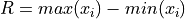
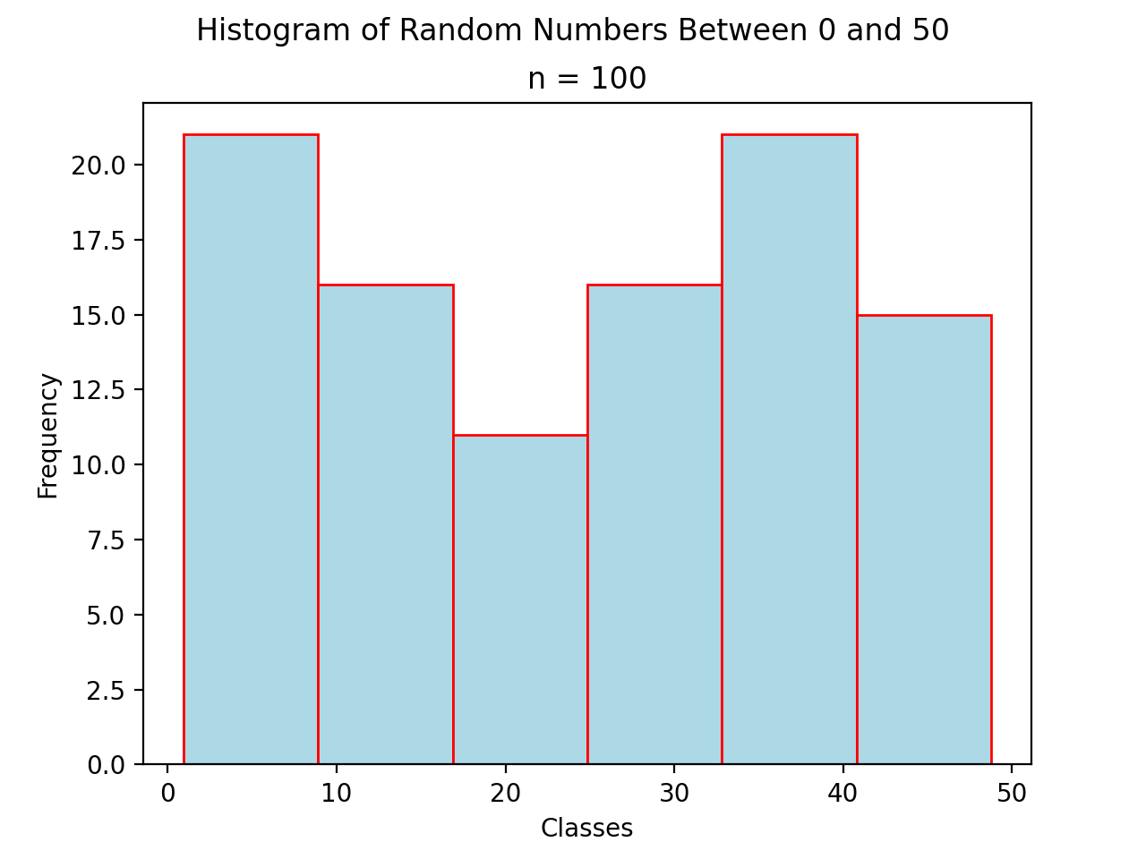
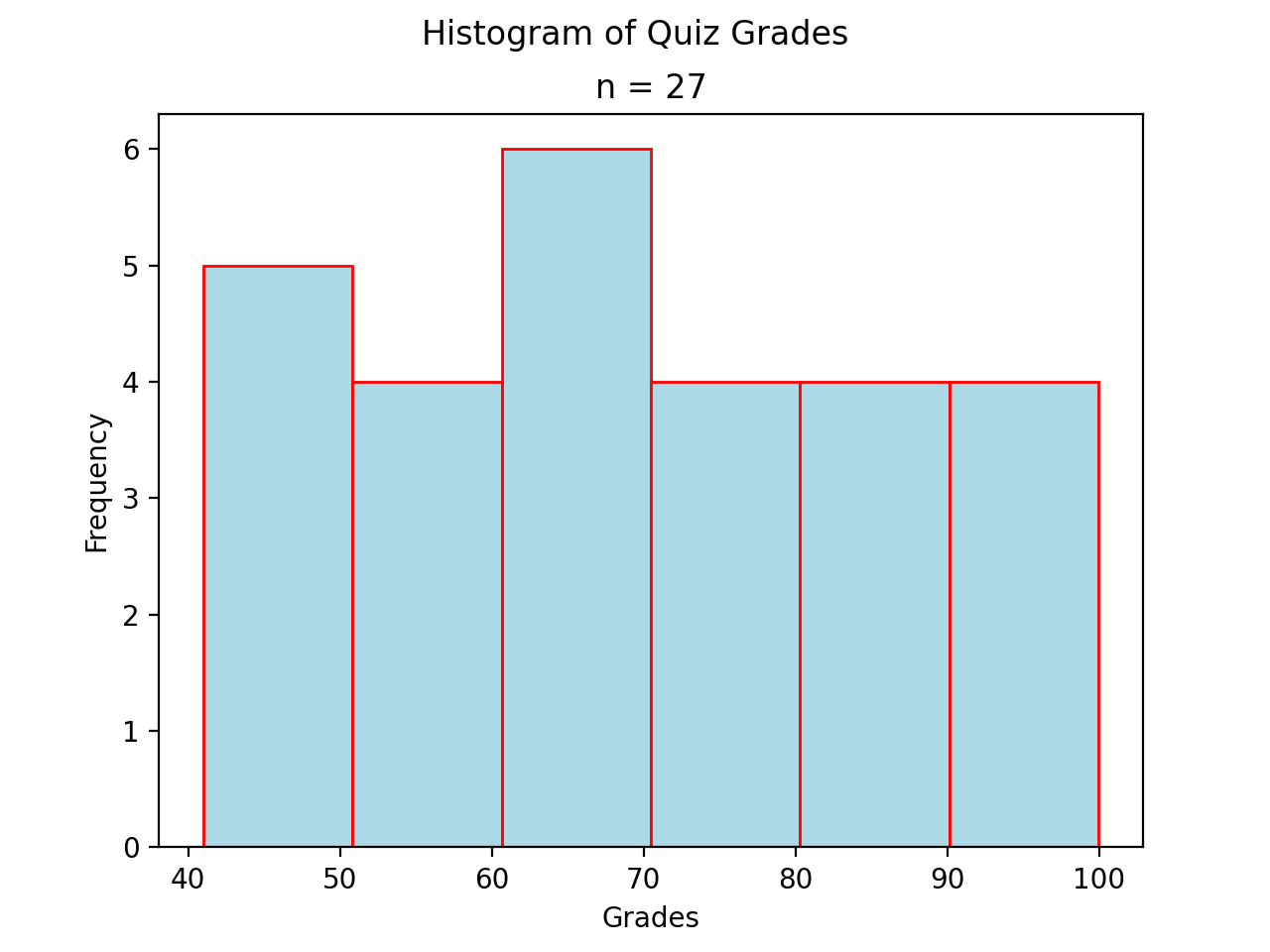
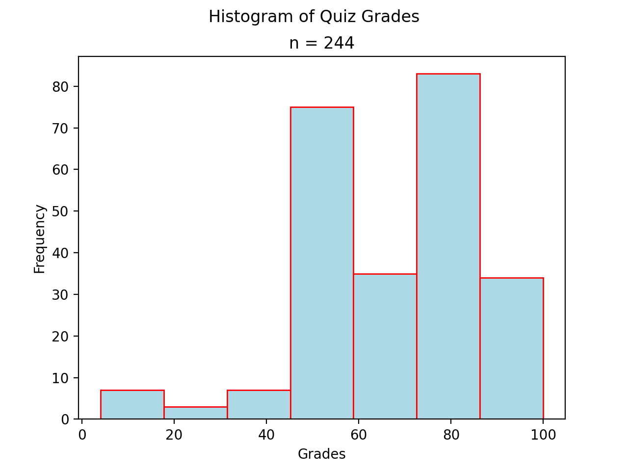
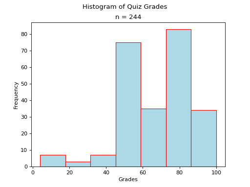
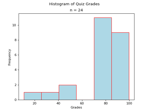
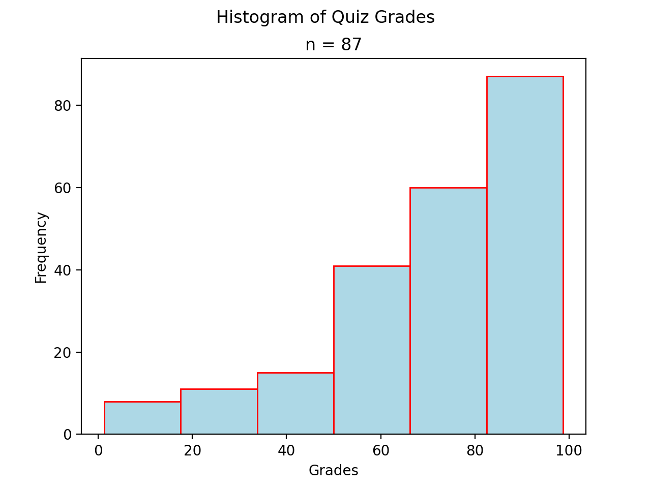
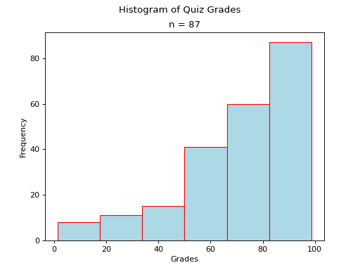
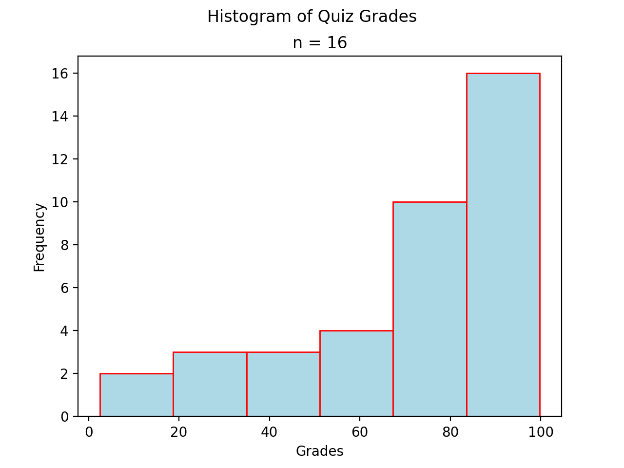
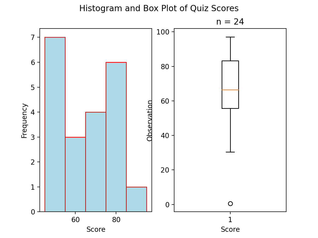
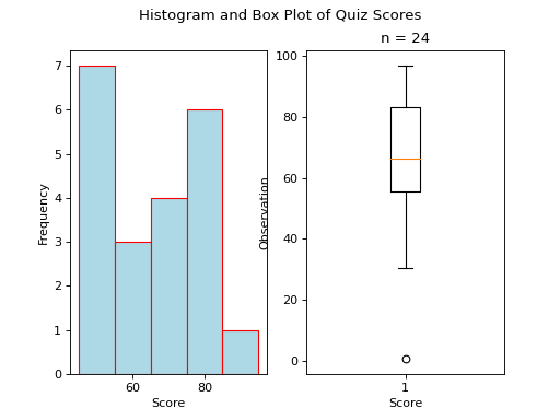
Histograms#
A histogram is a graphical representation of a frequency distribution. The classes or bins are plotted on the x-axis against the frequency of each class on the y-axis.
(Source code, png, hires.png, pdf)

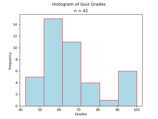
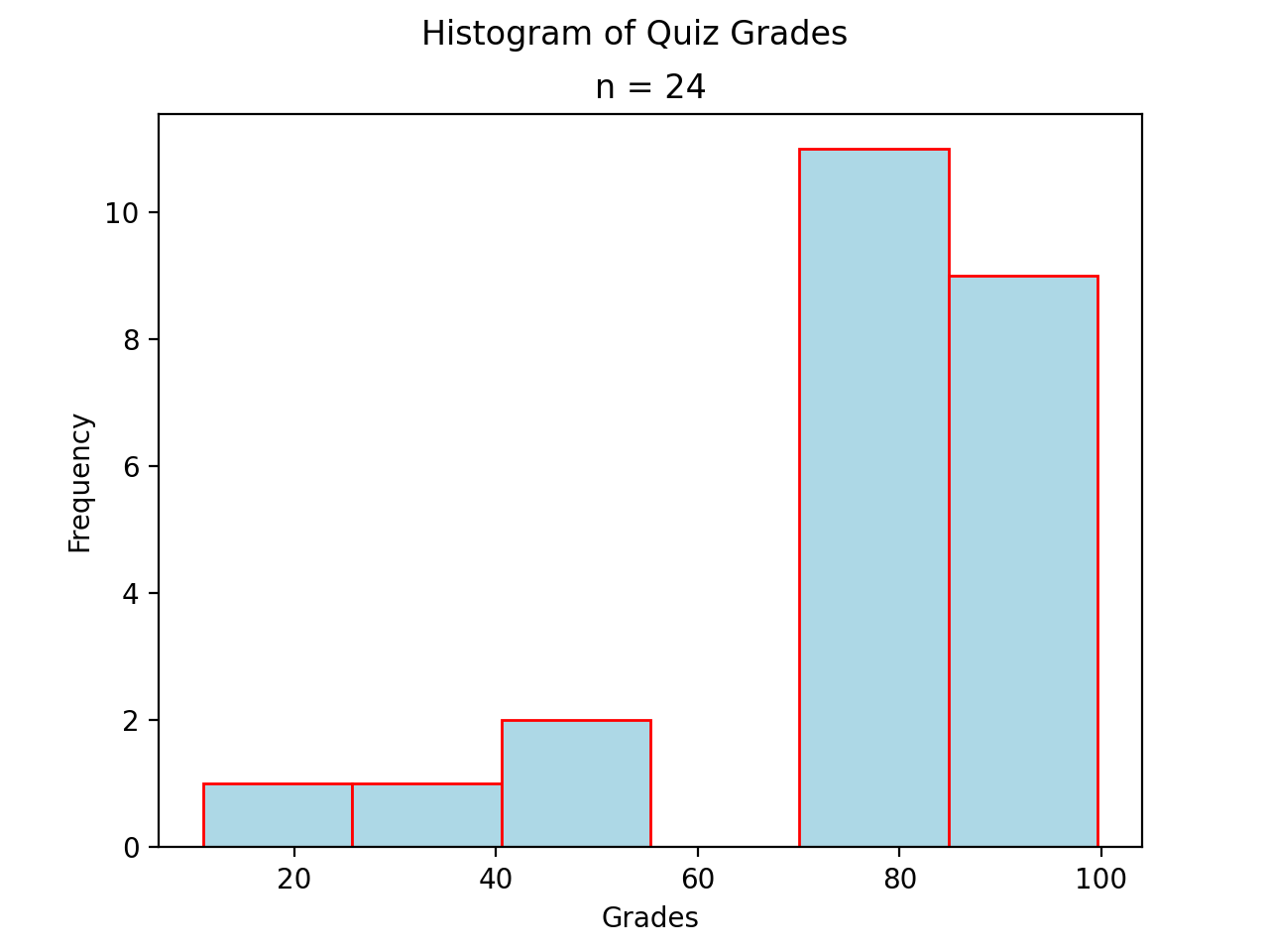
Variations#
A basic histogram can be modified to accomodate a variety of scenarios, depending on the specifics of the problem. In each case below, the sample’s frequency distribution is used as the basis for constructing the graph.
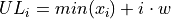
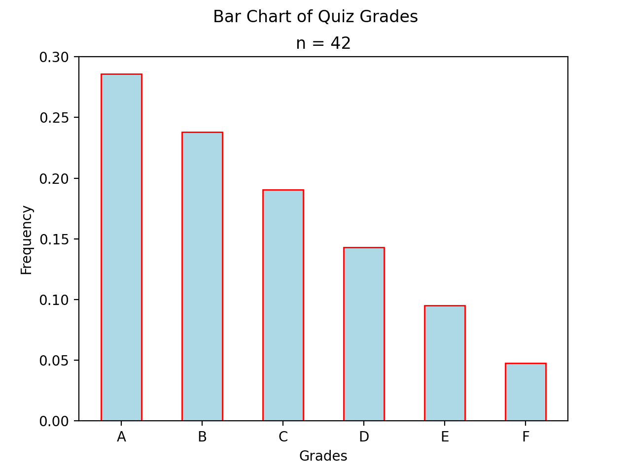
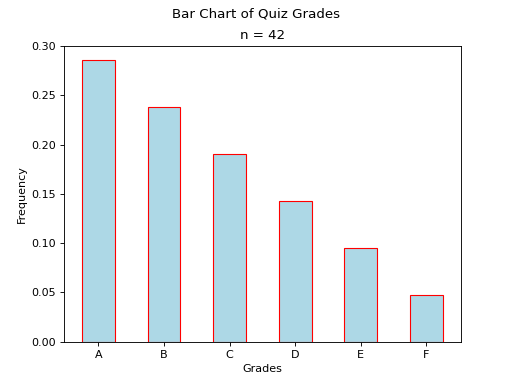
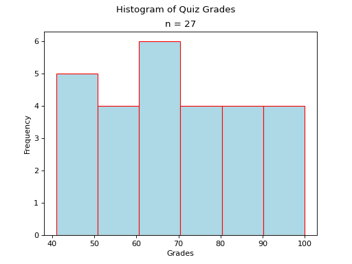
Bar Charts#
Sometimes the frequency distribution has already been calculated for us. In cases like this, a simple bar chart is all that is required.
(Source code, png, hires.png, pdf)
Stem-Leaf Plots#
TODO
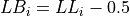
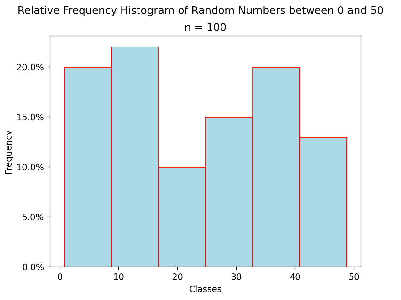
Relative Frequency Plots#
Relative frequency histograms express the frequency of each class as a percentage of the total observations in the sample,

(Source code, png, hires.png, pdf)

Distribution Shapes#
TODO
Uniform#
(Source code, png, hires.png, pdf)
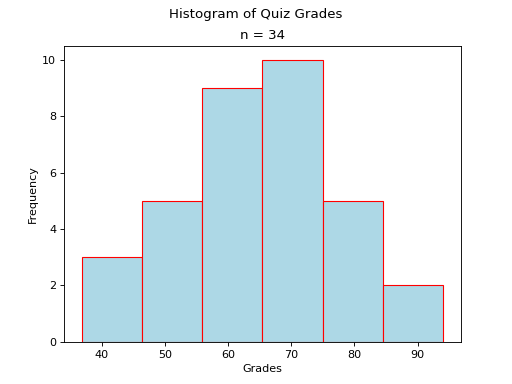
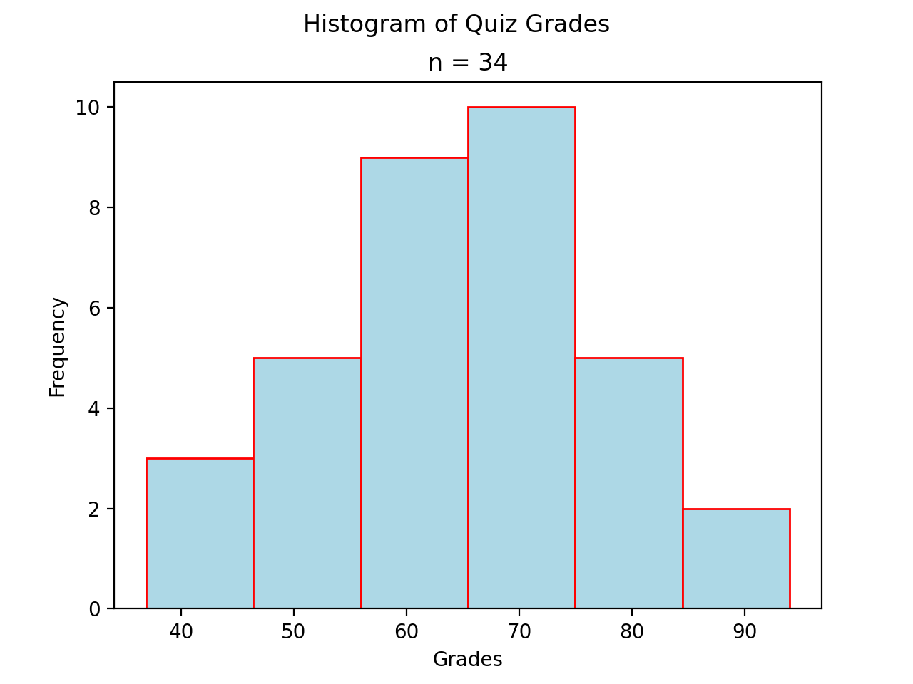
Normal#
(Source code, png, hires.png, pdf)

Bimodal#
(Source code, png, hires.png, pdf)
Skewed#
Skewed Right
(Source code, png, hires.png, pdf)
Skewed Left
(Source code, png, hires.png, pdf)
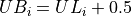
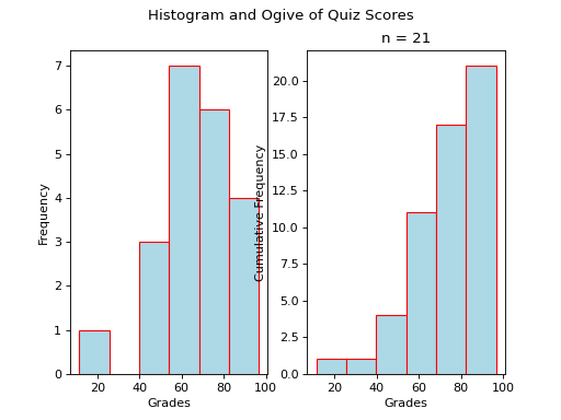
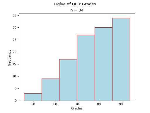
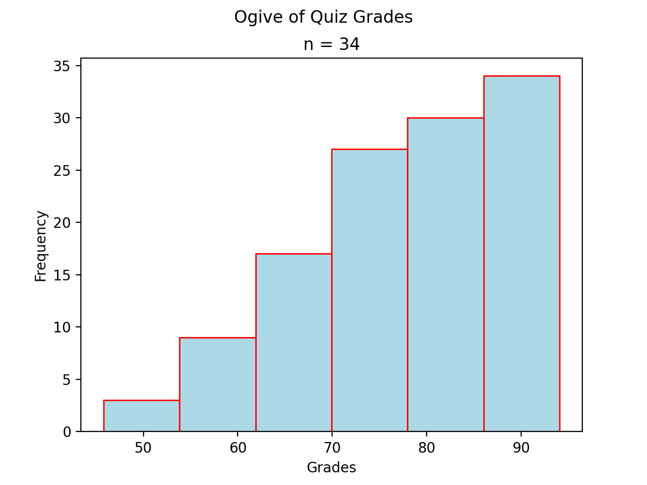
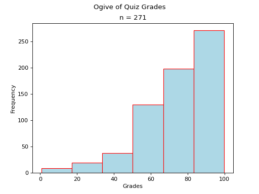
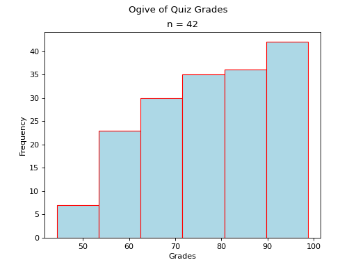
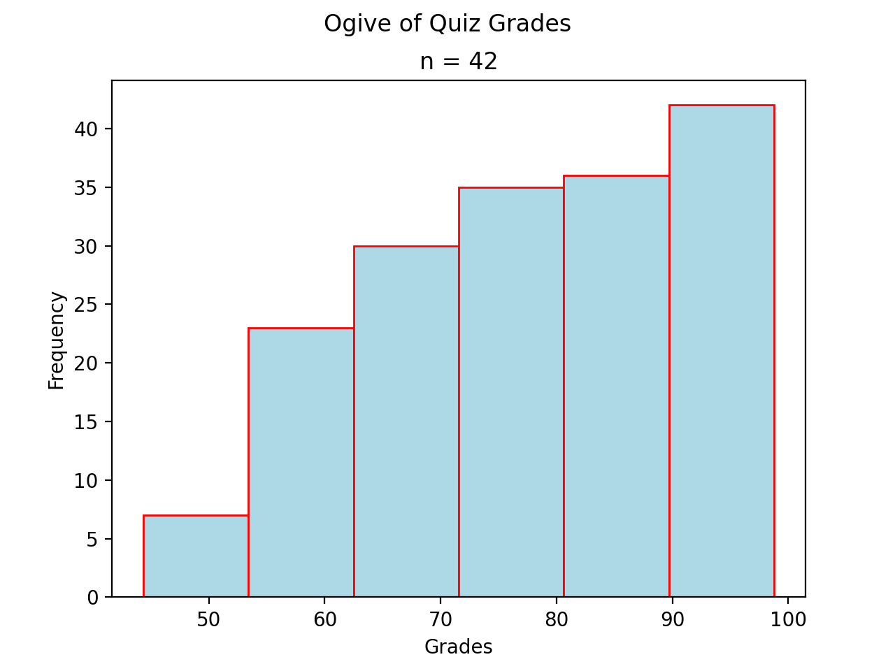
Ogives#
TODO
(Source code, png, hires.png, pdf)

Note
Your book’s authors call these types of graphs ogives. Be aware, you will almost never see these graphs referred to by that term. In practice, they are almost always called cumulative frequency distributions.
Construction#
Find the relative frequency distribution
Distribution Shapes#
TODO
Uniform#
(Source code, png, hires.png, pdf)
Normal#
(Source code, png, hires.png, pdf)

Bimodal#
(Source code, png, hires.png, pdf)
Skewed#
- Skewed Right
(
Source code,png,hires.png,pdf)
- Skewed Left
(
Source code,png,hires.png,pdf)
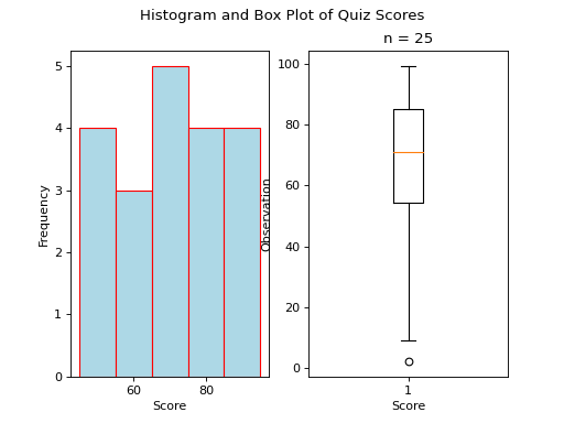
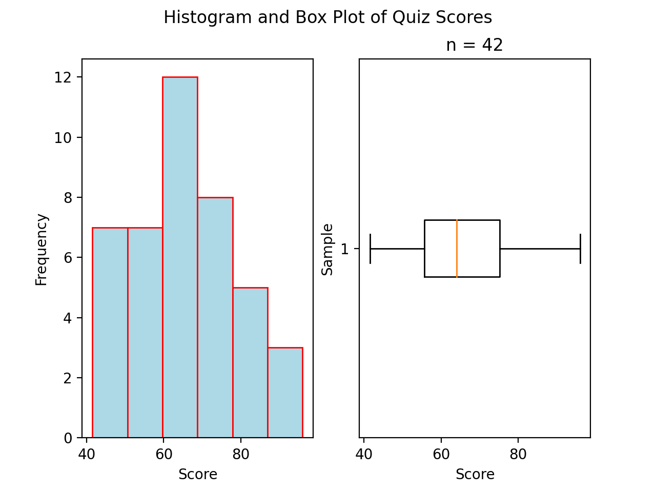
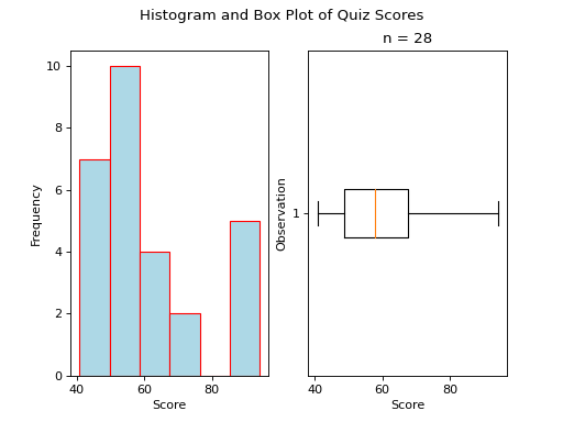
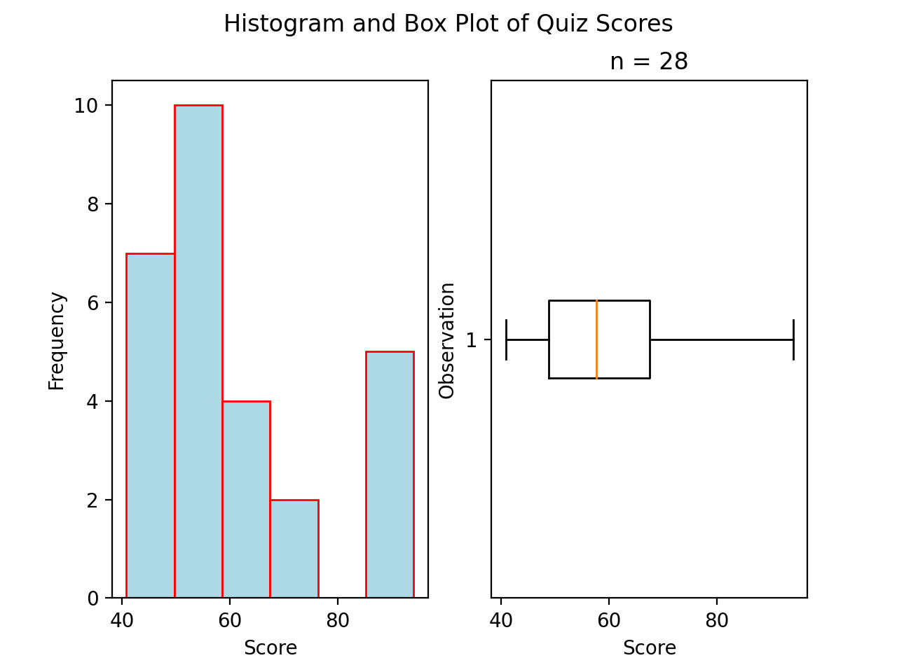
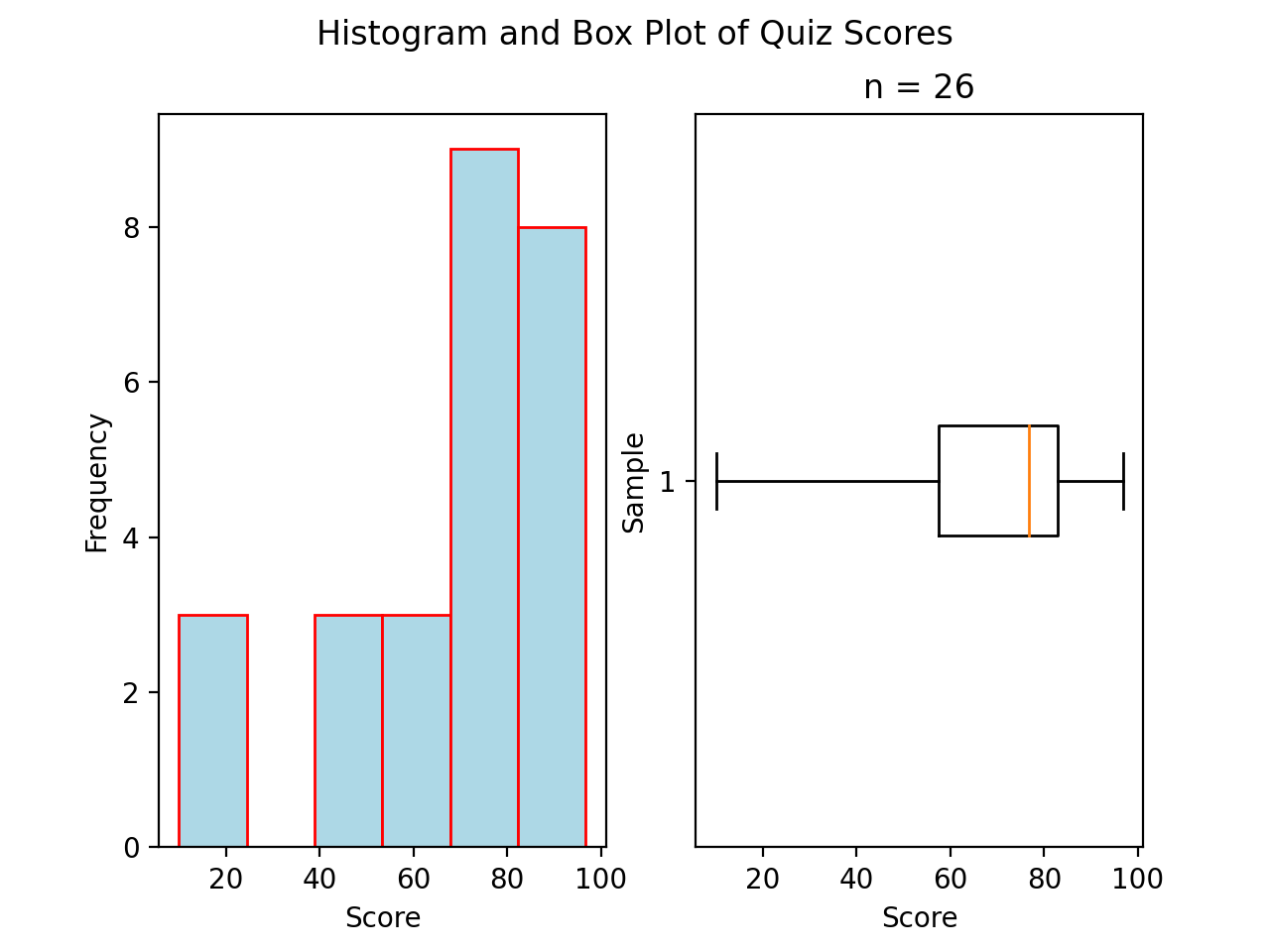
Boxplots#
While Histograms and Ogives provide a wealth of information about the sample distribution, they do not give us the whole picture.
Construction#
Find the maximum observation.
Find the 75 th percentile (third quartile)
Find the 50 th percentile (median)
Find the 25 th percentile (first quartile)
Find the minimum observation.
Distribution Shapes#
TODO
Uniform#
(Source code, png, hires.png, pdf)
Normal#
(Source code, png, hires.png, pdf)

Bimodal#
(Source code, png, hires.png, pdf)
Skewed#
Skewed Right
(Source code, png, hires.png, pdf)

Skewed Left
(Source code, png, hires.png, pdf)
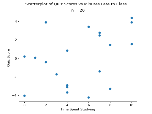
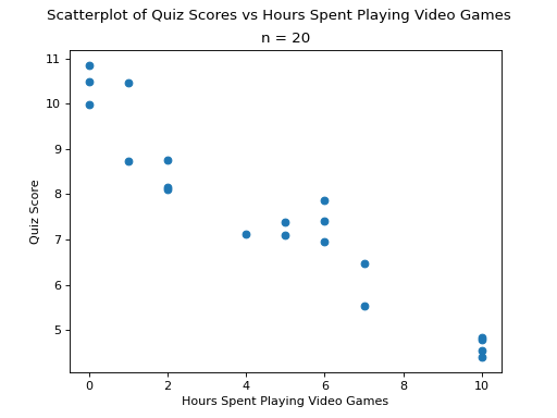
Scatter Plots#
No Correlation
(Source code, png, hires.png, pdf)

Positive Correlation
(Source code, png, hires.png, pdf)
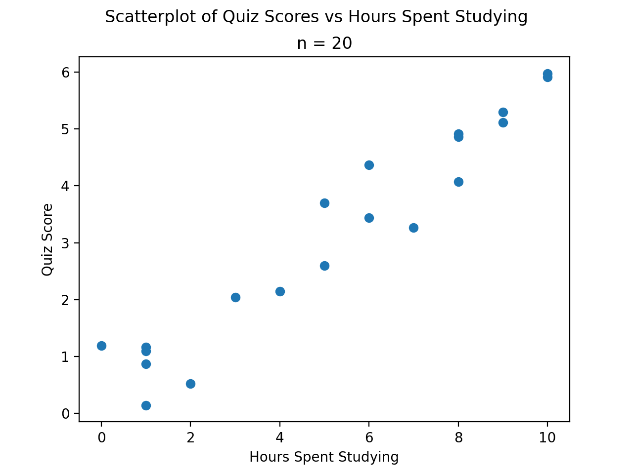

Negative Correlation
(Source code, png, hires.png, pdf)
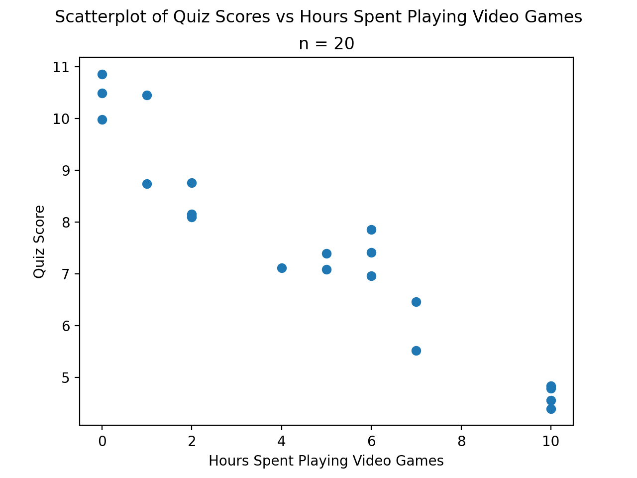
Other Types of Graphs#
TODO
Pie Chart#
TODO
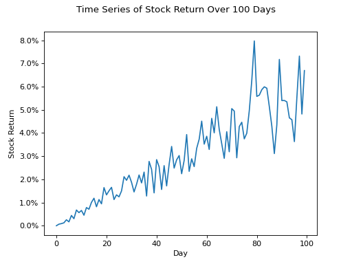
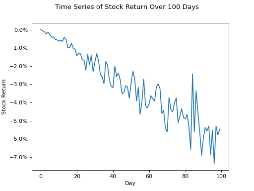
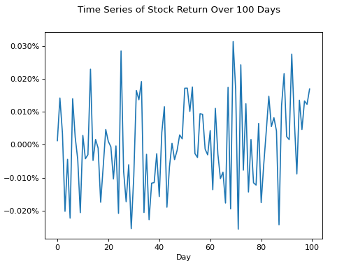
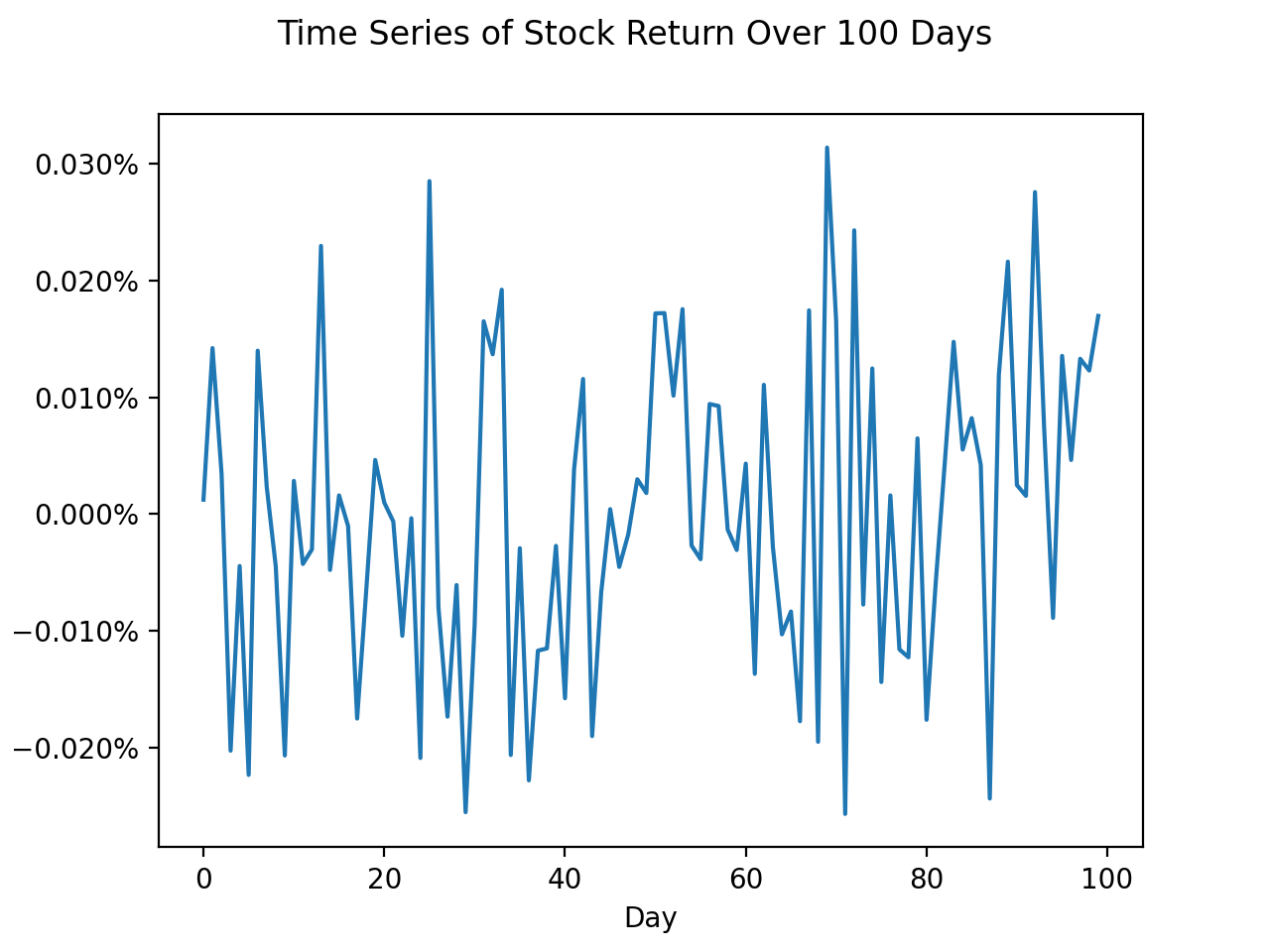
Time Series#
Positive Trend
(Source code, png, hires.png, pdf)
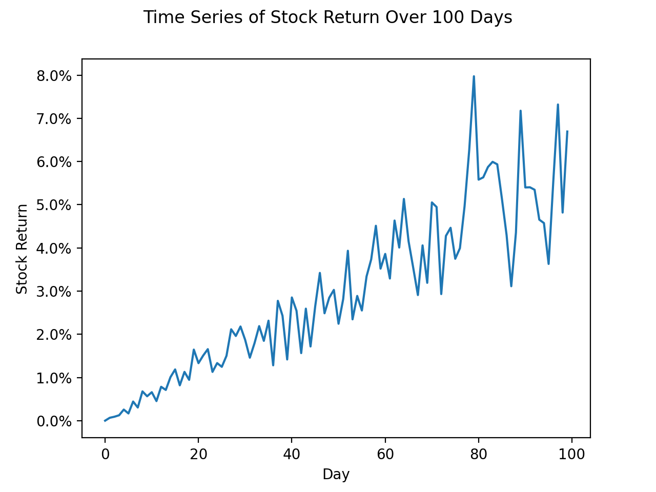
Negative Trend
(Source code, png, hires.png, pdf)

No Trend
(Source code, png, hires.png, pdf)
