Correlation#
Scatter Plots#
2008, Free Response, #4
An experiment was conducted to study the effect of temperature on the reliability of an electronic device used in an undersea communications system. The experiment was done in a laboratory where tanks of seawater were maintained at either 10 C, 30 C, 50 C, or 70 C. After the electronic devices were submerged in the tanks for 5,000 hours, each device was inspected to determine if it was still working. The following table provides information on the number of devices tested at each temperature and the number of working devices at the end of the 5,000-hour test.
Seawater temperature |
10 C |
30 C |
50 C |
70 C |
# of working devices |
29 |
42 |
21 |
12 |
# of devices tested |
30 |
50 |
30 |
20 |
You may assume that the result for any single device is not influenced by the result for any other device.
Using the information in the table, construct a scatterplot that would be useful for showing the effect of water temperature on the ability of the devices to work for at least 5,000 hours.

Comment on any trend or pattern that is revealed by the scatterplot you constructed.
An estimate of the proportion of devices that would work after 5,000 hours of submersion in 40 C seawater can be obtained by averaging the estimates at 30 C and 50 C. Compute this estimate and the associated standard error.
2010, Free Response, #1
Agricultural experts are trying to develop a bird deterrent to reduce costly damage to crops in the United States. An experiment is to be conducted using garlic oil to study its effectiveness as a nontoxic, environmentally safe bird repellant. The experiment will use European starlings, a bird species that causes considerable damage annually to the corn crop in the United States. Food granules made from corn are to be infused with garlic oil in each of five concentrations of garlic: 0 percent, 2 percent, 10 percent, 25 percent, and 50 percent.
The researchers will determine the adverse reaction of the birds to the repellant by measuring the number of food granules consumed during a two-hour period following overnight food deprivation. There are forty birds available for the experiment, and the researchers will use eight birds for each concentration of garlic. Each bird will be kept in a separate cage and provided with the same number of food granules.
For the experiment, identify
the treatments
the experimental units
the response that will be measured
After performing the experiment, the researchers recorded the data shown in the table below.
Garlic oil concentration |
0% |
2% |
10% |
25% |
50% |
Mean number of food granules consumed |
58 |
48 |
29 |
24 |
20 |
Number of birds |
8 |
8 |
8 |
8 |
8 |
Construct a graph of the data that could be used to investigate the appropriateness of a linear regression model for analyzing the results of the experiment.
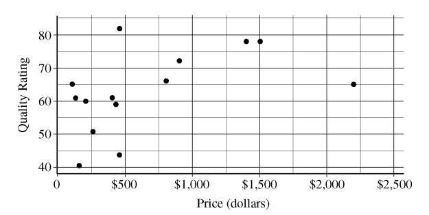
2012, Free Response, #1
The scatterplot below displays the price in dollars and quality rating for 14 different sewing machines.
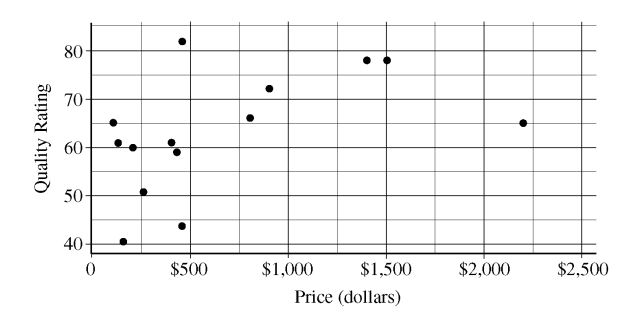
Describe the nature of the association between price and quality rating for the sewing machines.
One of the 14 sewing machines substantially affects the appropriateness of using a linear regression model to predict quality rating based on price. Report the approximate price and quality rating of that machine and explain your choice.
Chris is interested in buying one of the 14 sewing machines. He will consider buying only those machines for which there is no other machine that has both higher quality and lower price. On the scatterplot reproduced below, circle all data points corresponding to machines that Chris will consider buying.
2021, Free Response, #6
Attendance at games for a certain baseball team is being investigated by the team owner. The following boxplots summarize the attendance, measured as average number of attendees per game, for 47 years of the team’s existence. The boxplots include the 30 years of games played in the old stadium and the 17 years played in the new stadium.
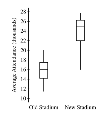
Compare the distributions of average attendance between the old and new stadiums.
The following scatterplot shows average attendance versus year,
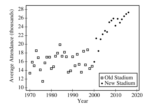
Compare the trends in average attendance over time between the old and new stadium.
Consider the following scatterplots,
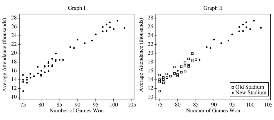
i. Graph I shows the average attendance versus number of games won for each year. Describe the relationship between the variables.
Graph II shows the same information as Graph I, but also indicates the old and new stadiums. Does Graph II suggest that the rate at which attendance changes as number of games won increases is different in the new stadium compared to the old stadium? Explain your reasoning.
Consider the three variables: number of games won, year, and stadium. Based on the graphs, explain how one of those variables could be a confounding variable in the relationship between average attendance and the other variables.