Graphical Representations#
In this section we study various ways of representing data graphically.
Frequency Distributions#
A frequency distribution is the foundation of most statistical graphs. In order to interpret graphs like histograms or pie charts, you must first understand what a frequency distribution represents.
A frequency distribution is a tabular summary (table) of a sample of data. It tells us how often each observation occurs.
Ungrouped Distributions#
The concept of an ungrouped distribution is intuitive and best seen by example.
- Example
Suppose you ask 10 people their favorite color and the following data set represents their answers,

Where
b = response of “blue”
g = response of “green”
o = response of “orange”
r = response of “red”
y = response of “yellow “
Describe the distribution of this sample with a an ungrouped frequency distribution.
Important
In this example, the individual would be the person being surveyed, while the variable being observed is their favorite color. The variable in this instance is categorical.
An ungrouped frequency distribtion is simply a table where each entry represents the Frequency of every possible observation,
|
f(x) |
|---|---|
b |
2 |
g |
2 |
o |
1 |
r |
4 |
y |
1 |
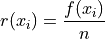
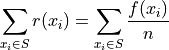
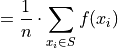
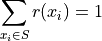
Notice the sum of the right hand column totals to the number of observations in the sample,  . We summarize this result below,
Take note of the index in this sum. The  symbol can be read as “for every
  in S”. This notation is used to take into account observations that may have the same value, as in this example where the observations
 b, g and r occur multiple times. In other words, each term of the sum is a unique value. Its multiplicity derives from the frequency  by which it is multiplied.
Contrast this against the notation employed in the sample mean formula

In the sample_mean_formula, the index is over the observation order, i.e. from  . In this case, it may happen that
  for some
  . In other words, in the sample mean formula, it is possible for terms in the summation to repeat.
Two Way Tables#
Tip
This section includes a lot of terminology that will be covered in upcoming Probability and Set Theory sections.
If you do not fully understand this section just yet, that is fine! Read Section 1.1 from the Starnes and Tabor textbook to fill in the gaps. Bookmark this page and come back to it after we have studied probability in more detail.
Often times, you are observing more than one categorical variable on a single individual. If each observation in the sample has two attributes (dimensions, properties), we call such data bivariate. A bivariate data set is represent with a set of ordered pairs  ,
,

For example, suppose we asked a sample of people the following questions:
Have you seen the Empire Strikes Back?
Have you seen the The Two Towers?
We may represent their response to the first question as  and
and  , i.e. “yes, I have seen the Empire Strikes Back” and “no, I have not seen the Empire Strikes Back”.
In a similar fashion, we may represent their response to the second question as  and
and  , i.e. “yes, I have seen The Two Towers” and “no, I have not seen The Two Towers”.
Suppose we sampled a group of ten people and asked them these questions. Then we might represent their responses with the following sample S, where the x variable is their response to the first question and the y variable is their response to the second question,

Even with a small sample of 10, this is a lot of information to process. A useful way to summarize this data into a more readable format is with a two-way table,
outcomes |
|
|
|
||
|
The Intersection of each row and column represents the simultaneous occurance of two events.
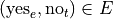
There are four events here, but two of them are related to the others.
To see this, let us define E to be the event of seeing the Empire Strikes Back and T to be the event of seeing The Two Towers.
The complement of event is its negation.
If E is the event of seeing the Empire Strikes Back, then  is the event of not seeing the Empire Strikes Back. We call
  and complementary events.
Similarly, if T is the event of seeing the Two Towers, then  is the event of not seeing the Two Towers. We call
  and complementary events.
Note
and partition the sample.
and partition the sample.
Complementary events are a type of partition.
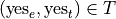
We can compose the events and their complements with the operation of intersection,
The event of seeing both movies.
In other words, seeing Empire Strikes Back and seeing The Two Towers.
The event of seeing the Empire Strikes Back but not The Two Towers.
In other words, seeing the Empire Strikes Back and not seeing the Two Towers.
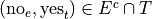
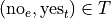
The event of not seeing the Empire Strikes Back, but seeing the Two Towers.
In other words, not seeing the Empire Strikes Back and seeing the Two Towers.
The event of seeing neither movie.
In other words, not seeing the Empire Strikes Back and not seeing the Two Towers.
Notice, just like the pair of events and and the pair of events and , the four events
form a partition of the sample. By this, we mean all of these events aggregated together comprise the entire sample  .
.
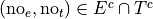
With these definitions in hand, we can think of the table being filled like so,
events |
|
|
|
|
|
|
|
|
Note
Events are composed of outcomes. Or, as we phrased it above, outcomes belong to events. Outcomes represent the values the observable variables assumes; Events represent ways of “parsing” or “grouping” the outcomes into abstractions, otherwise known as sets.
In symbols,
We read this as,
the outcome of
.
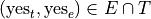
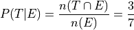
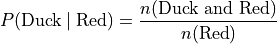
The joint probability (percentage) of two events occuring is given by classical definition of probability. For example, the percentage of people who have seen the Empire Strkes Back and the Two Towers,
In this case,  . To find
  , we count up all the outcomes that satisfy the condition of seeing both movines, or in symbols,
And similarly for the rest of the events.
outcomes |
|
|
|
3 |
2 |
|
4 |
1 |
Therefore,
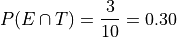
In plain English, “30 percent of people in this sample have seen both movies”.
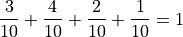
There are many things a table like this tells us. In the next few sections we will take a look at a few of the important facts it is telling us.
As we study this table, keep in mind the following question,
Think About It
In what ways does this table add up to 100%?
Whenever we encounter something that sums to 100%, it is a fair guess it represents a type of distribution.
Joint Frequency Distribution#
The most obvious to make this table equal 100% is through its joint frequency distribution. Each entry in the table must sum to the total number of observations,

Where  is the total number. In this case, we have,

We may also express this in terms of relative joint frequency, by dividing through by the total number of observations, 10,

Take note: each event, ,  ,
,  and
and  , taken together divided the entire sample in groups that share no outcomes. In other words, each event is mutually exclusive with every other event. More than that, the events compass the entire sample space.
We call events that divide the entire sample into mutually exclusive groups a partition of the sample.
Tip
Think of an event as a group of outcomes. Or, more precisely, a set.
Important
Any time a set of events partition an entire sample into sets of mutually exclusive outcomes, then those events form a distribution.
Marginal Frequency Distribution#
In the previous section, we observed both values of the categorical variable simultaneously. We may choose, for whatever reason, to ignore one of the variable. For example, if instead of asking every person in our example if they had seen the Empire Strikes Back and the Two Towers, we had only asked each individual the only first question, then we would have an ordinary frequency distribution. In others, ignoring the y variable, we can get the following distribution,
|
|
7 |
3 |
Notice this row represents the sum of each column in the original joint frequency distribution.
Note
You can think of this distribution being attached to the bottom margin of the joint frequency distribution as a row of totals,
outcomes |
|
|
|
3 |
2 |
|
4 |
1 |
Totals |
7 |
3 |
Moreover, it must also total to n,
This may also be expressed in terms of percentages as,
Similarly, if we had restricted our attention to only the question of whether people in the sample had seen the Two Towers, we would have,
x_i |
f(x_i) |
|
5 |
|
5 |
Notice this column represents the sum of each row in the original joint frequency distribution.
Note
You can think of this table being attached to the right margin of the joint frequency distribution as a column of totals,
outcomes |
|
|
Total |
|
3 |
2 |
5 |
|
4 |
1 |
5 |
Morever, it must also total to n,

Or, expressed in terms of percentages,
When one variable is ignored entirely, i.e. if only one variable is observed for each individual, the distribution formed by the partition is known as a marginal frequency distribution.
Conditional Frequency Distribution#
Yet another way to make this table equal 100% is through its conditional frequency distribution. A conditional frequency distribution can be understood as the distribution of one variable given the value of the other variable.
A more precise definition of a conditional frequency of given  might go,
The conditional frequency is proportion of times the outcomes
We can state this definition mathematically,
Where A is defined as the event of the variable being observed to be a particular value and B is defined as the event of the variable being observed to be a particular value.
In other words, in the context of our example, where each variable may assume two values,


We have the following outcomes that belong to E, the event of seeing the Empire Strikes Back,
And, likewise, we have the following outcomes that belong to T, the event of seeing the Two Towers,
The conditional distribution of either variable with respect to the other can be understood as follows:
The conditional distribution of people who have seen the Empire Strikes Back answers the following question:
What percent of the people who have seen Empire Strikes Back have seen the Two Towers?
What percent of the people who have seen Empire Strike Back have not seen the Two Towers?
In other words, given a person has seen Empire Strikes Back, the conditional distribution will tell you what percent of the reduced sample has seen or not seen the Two Towers.
In this case, we are conditioning on the  variable, the variable which measures whether or not someone has Empire Strikes Back. We may also condition on the
  variable, to get the conditional distribution of people who have seen the Two Towers. This distribution will answer the following questions,
What percent of the people who have seen Two Towers have seen the Empire Strikes Back?
What percent of the people who have seen Two Towers have not seen the Empire Strikes Back?
Important
The questions:
What percent of the people who have seen Empire Strikes Back have seen the Two Towers?
What percent of the people who have seen Two Towers have seen the Empire Strikes Back?
are not asking the same question. The difference is subtle, but huge!
In the first case, we are narrowing our attention down to only those people who have seen the Empire Strikes Back and asking what percent of them have seen the Two Towers. Therefore, to calculate the conditional frequency of Two Towers viewership given Empire Strikes Back viewership ,
Whereas in the second case, we are narrowing our attention down to only those people who have seen Two Towers and asking what percent of them have seen the Empire Strikes Back. Therefore, to calculate the conditional frequency of Empire Strikes Back viewership given Two Towers viewership,
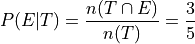
In other words, a higher percentage of Two Towers viewers have also seen Empire Strikes Back than the percentage of Empire Strikes Back viewers who have also seen the Two Towers.
Grouped Distributions#
Up to this point, we have been dealing with categorical data. An ungrouped distribution is very easily extracted from categorical data. When we consider quantitative data, the situation becomes more complicated.
Quantitative data comes in two forms:
Discrete
Continuous
When the data are discrete, it may be possible to get by with an ungrouped distirbution, however ungrouped distributions can get cumbersome when the Range of the data is very large. Consider a sample of data composed of the first 100 random natural numbers
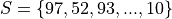
In this case, counting the frequency of each individual observation can quickly become tedious.
When the data are continuous, ungrouped distributions are no longer a tenable solution. For example, consider the following dataset which represents the eruption length and period between eruptions for the famous geyser Old Faithful at Yellowstone National Park in Wymoing.
eruptions |
waiting |
3.6 |
79 |
1.8 |
54 |
3.333 |
74 |
2.283 |
62 |
4.533 |
85 |
2.883 |
55 |
4.7 |
88 |
3.6 |
85 |
1.95 |
51 |
4.35 |
85 |
1.833 |
54 |
3.917 |
84 |
4.2 |
78 |
1.75 |
47 |
4.7 |
83 |
2.167 |
52 |
Attempting to create an ungrouped distribution of this data would be a futile effort. Therefore, the standard approach with datasets like this is to create an grouped frequency distribution.
Steps#
If you are given a sample of n data points 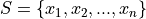 , then the steps for finding a grouped frequency distribution are as follows,
Find the range of the data set.
Choose a number of classes. Typically between 5 and 20, depending on the size and type of data.
Find the class width. Round up, if necessary.

Note
Using the Ceiling Function from a future section, we could simply write,

And the rounding would be implied.
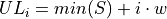
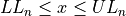
Find the lower and upper class limits LLi and ULi, for each i up to n, i.e. for each class, by adding multiples of the class width to the sample minimum.


Sort the data set into classes and tally up the frequency of each class.
Class Limits |
f(x) |
|
|
|
|
… |
… |
|
|

Important
Note each class is inclusive,  , with respect to the lower limit, while it is strictly exclusive,
  , with respect to the upper limit. This is so the classes are mutually exclusive, or to the say the same thing in a different way, a single observation cannot be assigned to two different classes; Every individual can belong to only one class.
This applies to every class except the last, which must include the upper limit. Otherwise, the distribution would be missing a single value: the maximum value of the sample.
- Example
Suppose you measure the height of everyone in your class and get the following sample of data, where each observation in the data set is measured in feet,

Find the grouped frequency distribution for this sample of data using
 classes.
First we find the sample range,

We divide this interval into 5 sub-intervals, called classes,
Then the lower class limits and upper class limits are found by adding successive multiples of the class width to the minimum value of the sample.
The limits of the first class are given by,


The limits of the second class are given by,


The limits of the third class are given by,


The limits of fourth class are given by,


The limits of the fifth class are given by,


Using this limits, we can construct the table,
Class Limits |
|
|
3 |
|
2 |
|
4 |
|
2 |
|
1 |
Tip
A quick check to verify the grouped frequency distribution has been constructed correctly is to sum the frequencies and ensure they total up to the number of samples.
In this case, the total number of samples is 12 and,

Histograms#
A histogram is a graphical representation of a frequency distribution. The classes or bins are plotted on the x-axis against the frequency of each class on the y-axis.
(Source code, png, hires.png, pdf)

The width of the bars is normalized so that the bars of the histogram meet.
Variations#
A basic histogram can be modified to accomodate a variety of scenarios, depending on the specifics of the problem. In each case below, the sample’s frequency distribution is used as the basis for constructing the graph.
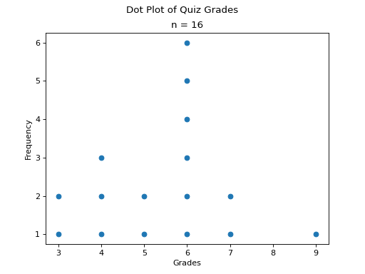
Dot Plots#
Instead bars with differing heights, dot plots use stacked dots to represent the number of times each observation occurs, i.e. its frequency.
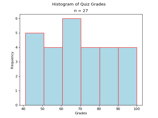
Suppose a quiz with nine questions was administered to an A.P. Statistics course. The following sample represents the number of questions answered correctly by each student in this class,

Then the dot plot is constructed by drawing a number of dots above a point on the number line that corresponds to the frequency of that observation.
(Source code, png, hires.png, pdf)

Dot plots are a quick and easy to represent a sample of data graphically. When in doubt, throw together a dot plot to see if it gives you any clues about the distribution.
Stem-Leaf Plots#
A stem-leaf plot is a type of histogram where the classes are determined by the leading digits of the observation values.
For example, you measured the average annual rainfall in inches for Maryland over the course of 20 years and arrived at the following sample,

A stem-and-leaf plot is a tabular summary (table) where the first column, called the stem column, is the leading digits that occurs in the sample, in this case 3, 4, 5 and 6. The digits after the leading digit after tallied up and written in ascending order in the second column, called the leaf column,
Stem |
Leaf |
3 |
3, 3, 7, |
4 |
2, 2, 3, 6, 6, 6, 9, 7, 7 |
5 |
0, 1, 1, 2 |
6 |
1,1 |
Stem-and-leaf plots are convenient for finding the Mode of a distribution; the Mode is simply the observation with the most number of leaves, in this case, 46 inches.
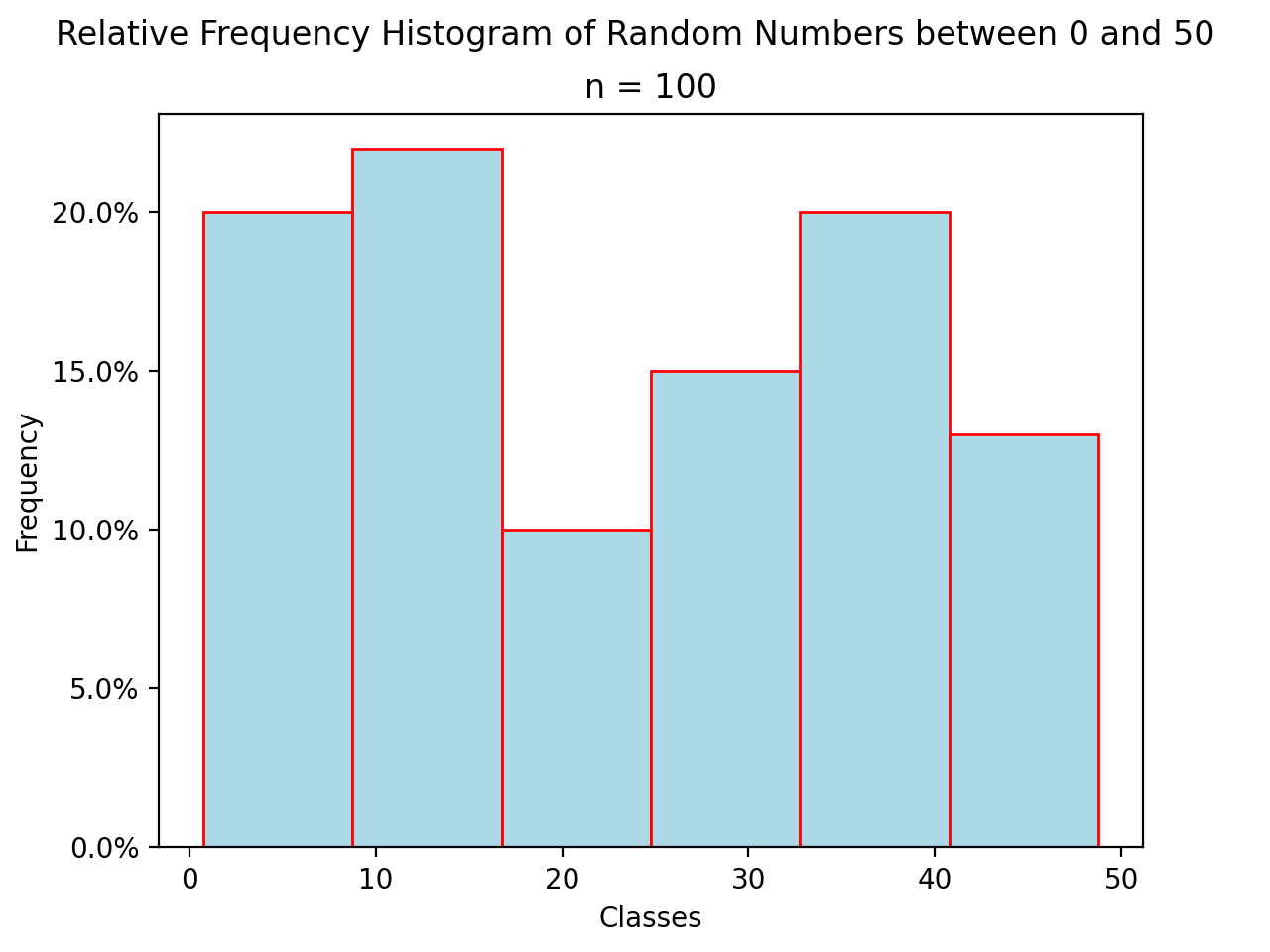
Relative Frequency Plots#
Relative frequency histograms express the frequency of each class as a percentage of the total observations in the sample,
Recall that the sum of frequencies is n,
Therefore, the sum of relative frequencies is,
Since the sum does not depend on n, we can factor  out of the denominator,
Whence, we apply the Frequency Equation to get,

In other words, the sum of relative frequencies is equal to 1,
This intuitive result simply means the distribution must total to 100%.
In other words, relative frequency histograms do not change the shape of the distribution; they scale (normalize) the distribution so that the sum of class frequencies is 100%.
(Source code, png, hires.png, pdf)

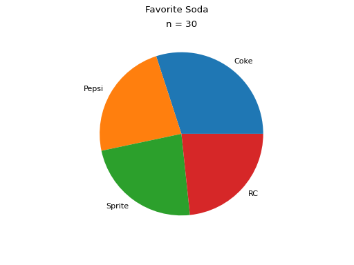
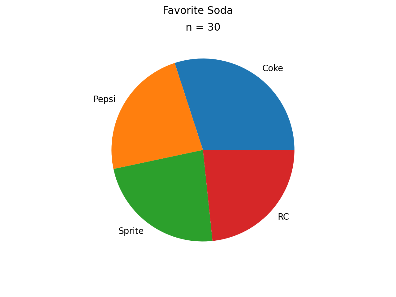
Pie Charts#
Pie charts are a special type of relative frequency histogram. Since the relative frequencies sum to 1, we can represent the distribution as one circle and then express the proportion the distribtion that belongs to class by the proportion of area in a circular sector.
In other words, the size of each slice of the pie represents the relative frequency of that class.
(Source code, png, hires.png, pdf)

Distribution Shapes#
The shape of the histogram tells a story about the distribution of the sample.
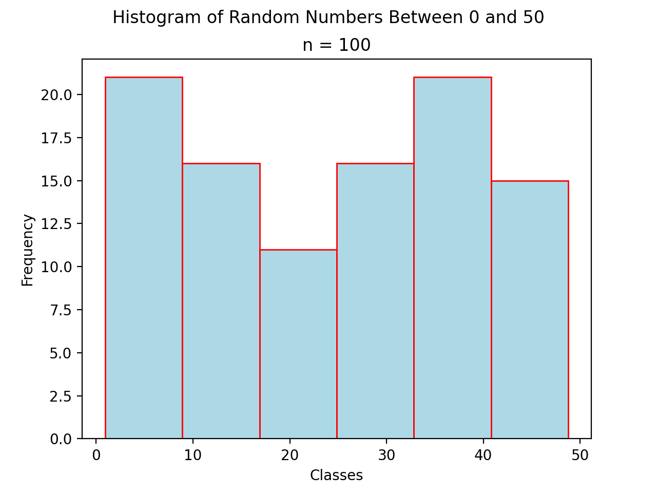
Uniform#
A histogram where each class is approximately level with every other class is known as a uniform distribution.
(Source code, png, hires.png, pdf)
A uniform distribution tells us each class is equally likely. In other words, if we were to randomly select an individual from this sample, there is an equal chance the selected individual will come from each class.
- Example
Find yourself a die and roll it 30 or so times, keeping track of each outcome. Once you have a large enough sample, create and graph a frequency distribution. The resulting display will approximate a uniform distribution.
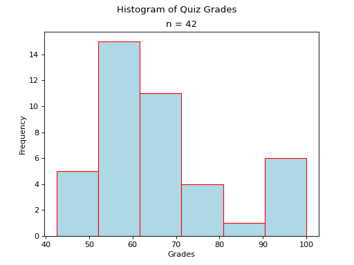
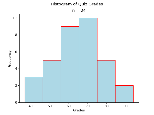
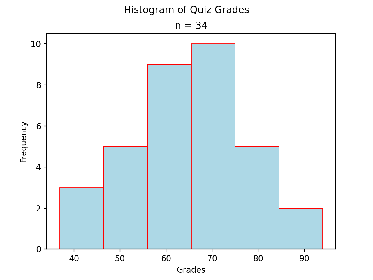
Normal#
A histogram where the classes are symmetric and decreasing around a common point is known as normal.
(Source code, png, hires.png, pdf)

The line of symmetry in a perfectly symmetrical distribution is the Median. The reason for this can seen by equating the area under the distribution with the proportion of the sample that belongs to that area. Since the areas on either side of a symmetric distribution are equal,
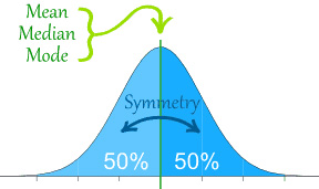
It follows these areas both represent fifty percent of the distribution.
A normal distribution tells us classes closer to the Median are more likely to be observed.
- Example
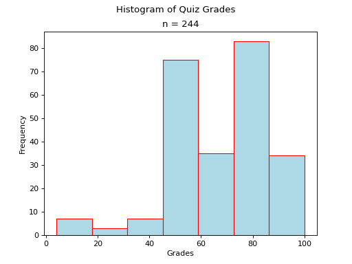
Old Faithful is a famous hot-water geyser in Yellowstone National Park that erupts every 45 minutes to 2 hours.
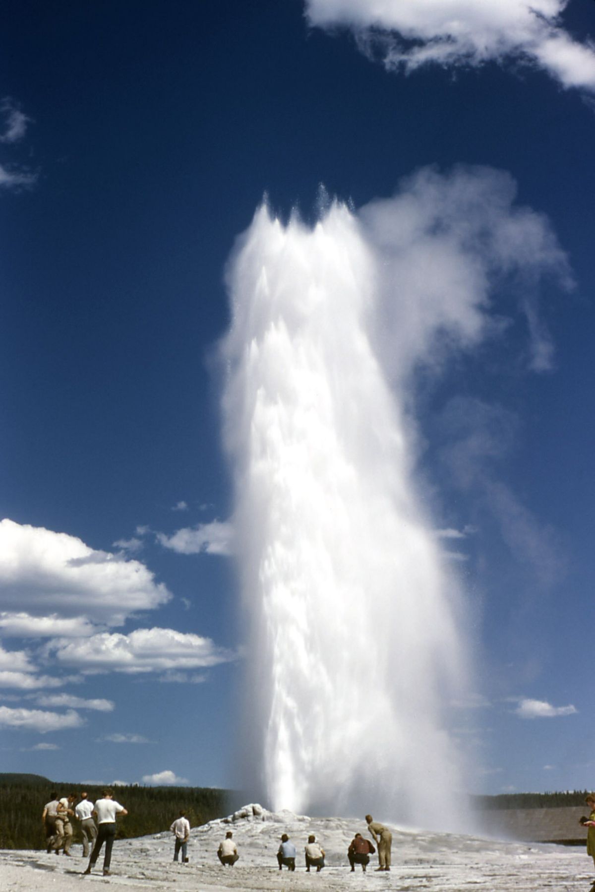
The first column of this dataset represents the length of an eruption in minutes while the second column represents the waiting time in minutes until the next eruption.
Note
We will construct the histogram for this dataset in class using Python3 using the length of an eruption in minutes.
Note
We will also look at this dataset again when we get to Correlation and Scatter Plots.
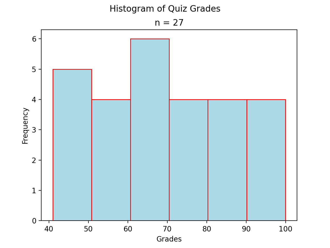
Bimodal#
A histogram where two classes are more frequent than the other classes in the distribution is known as bimodal.
(Source code, png, hires.png, pdf)
- Example
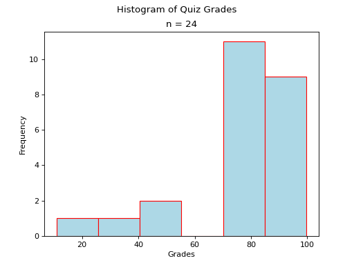
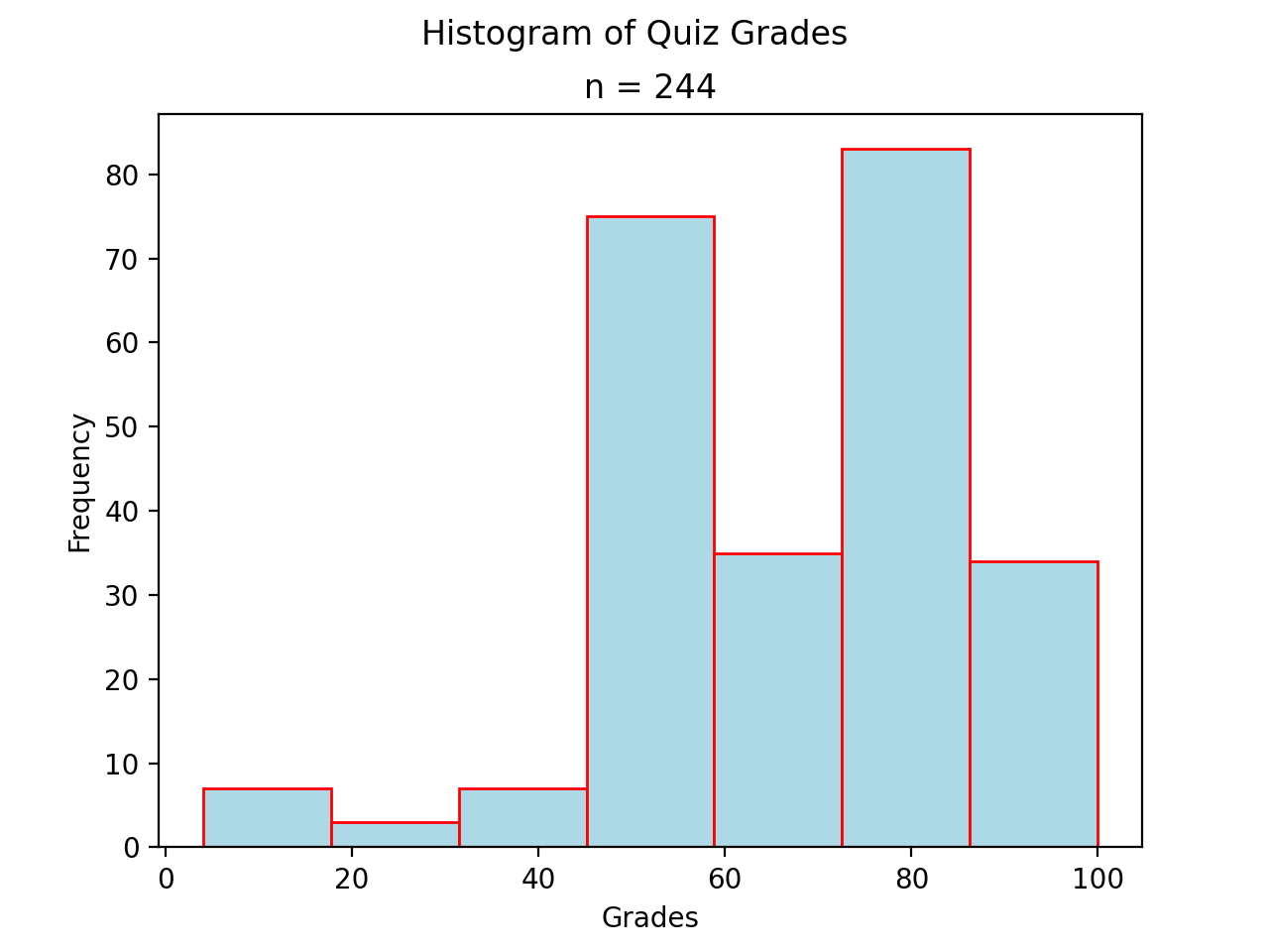
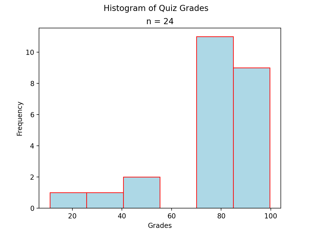
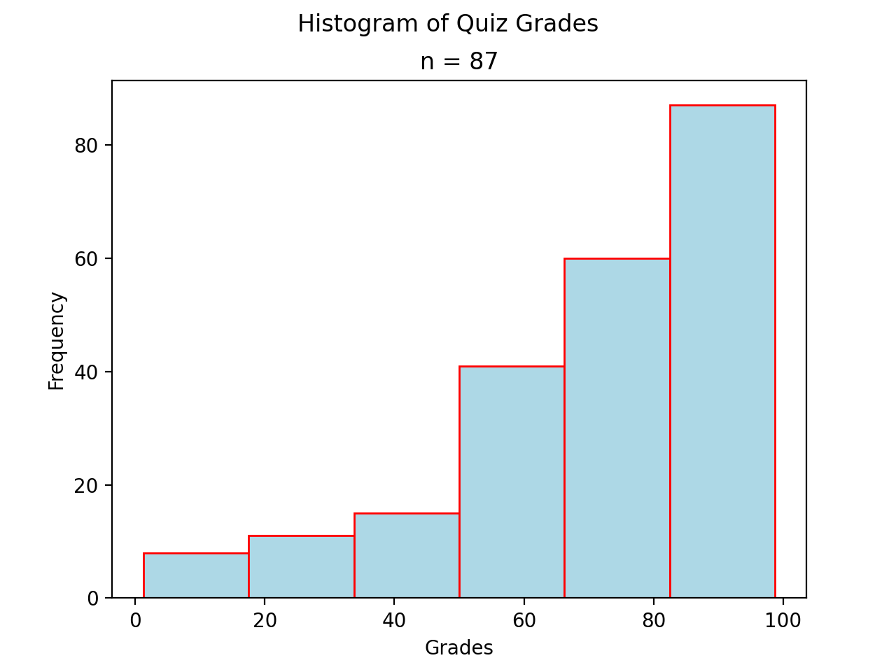
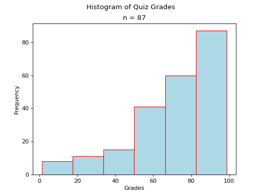
Skewed#
- Definition
A skew is a feature of sample where more data is clustered on one side of the sample than the other. We say such data are “skewed”, or that it exhibits “skewness”.
A skewed distribution has tails, indicating the distribution is not symmetric (or, asymmetric). Individuals drawn from a skewed distribution are more likely to have extreme values. By “extreme” we mean values outside of the intervals where the majority of the distribution lies.
Skewed Right
(Source code, png, hires.png, pdf)
- Example
here.
Note
We will construct the histogram for this dataset in class using Python3 in Normality.
Skewed Left
(Source code, png, hires.png, pdf)
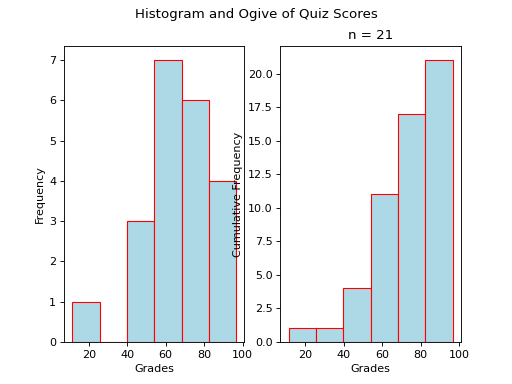
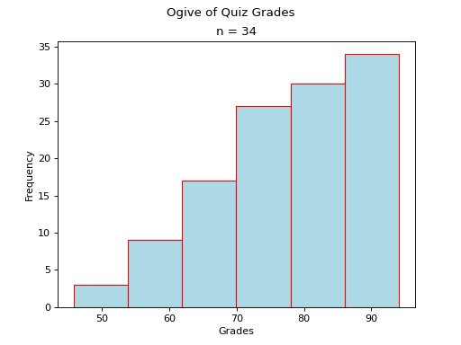
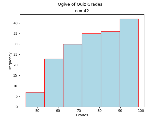
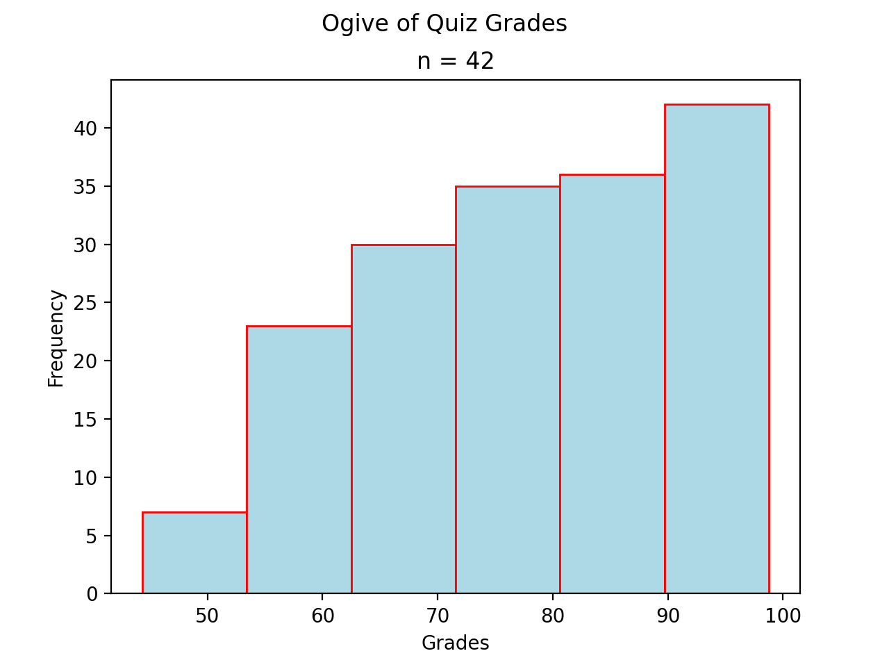
Ogives#
An ogive is a histogram of the cumulative frequency. The difference between frequency and cumulative frequency is slight, but potent.
- Frequency
The number of times an observation
occurs in a sample.- Cumulative Frequency

The number of times an observation less than or equal to
occurs in a sample.
Notice, by definition,
Warning
Be mindful of the indices in the summation. This summation says “add up all the frequencies up to a certain observation ”.
In order to construct an ogive or a cumulative frequency histogram, we first have to find the cumulative frequency distribution.
Recall the frequency distribution created in the Ungrouped Distributions section. The cumulative frequency of this distribution can be found by adding another column that sums up the the individual frequencies of all the classes up to that class,
Class Limits |
|
|
|
3 |
3 |
|
2 |
5 = 2 + 3 |
|
4 |
9 = 4 + 2 + 3 |
|
2 |
11 = 2 + 4 + 2 + 3 |
|
1 |
12 = 1 + 2 + 4 + 2 + 3 |

(Source code, png, hires.png, pdf)

Distribution Shapes#
All cumulative frequency histograms (ogives) are monotonic. A monotonic functions is non-decreasing. Another way of saying non-decreasing is to say “always increases or stays the same”. The reason for this should be clear: we are always adding quantities to the cumulative frequency as increases. The cumulative frequency never decreases.
Thus, it can sometimes be difficult to discern any features of the distribution from the cumulative frequency histogram. Nevertheless, closer inspection reveals a few things we can infer.
Uniform#
(Source code, png, hires.png, pdf)
Note
Notice each step in the ogive increase by roughly the same amount. This is because frequencies in a uniform distribution are roughly equal.
Normal#
(Source code, png, hires.png, pdf)

Note
Notice the steps in the graph increase in size up to the center and then decrease in size until the ogive levels off. This is because normal distributions are centered around the mean and drop off in frequency as distance from the mean increases.
Bimodal#
(Source code, png, hires.png, pdf)
Note
Notice there are two steps in the graph larger than the rest, due to the large frequencies of the modes in a bimodal distribution.
Skewed#
- Skewed Right
(
Source code,png,hires.png,pdf)
- Skewed Left
(
Source code,png,hires.png,pdf)
Variations#
Stacked Bar Chart#
A stacked bar chart is a type of ogive that is used specifically for categorical data. In particular, it is meant to visualize the Conditional Frequency Distribution of one categorical variable with respect to all the other values of the other categorical variable.
With a stacked bar chart, the sample is broken up into non-overlapping (mutual exclusive) groups. The conditional distribution of each group is plotted as a vertical bar that totals to 100%,
(Source code, png, hires.png, pdf)
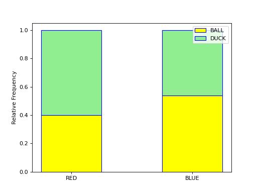
Each bar of the graph is conditioned on one variable. In this example, the condition is the event of a red object or a blue object. Given a blue object has been selected from the groups on the horizontal axis, the conditional distribution of shape (i.e., duck or ball) is plotted on the vertical axis.
In this example, the red group is broken down into a distribution of ducks and balls according to the formulae,
Where as the blue group is broken down into a distribution of ducks and balls according to the formulae,
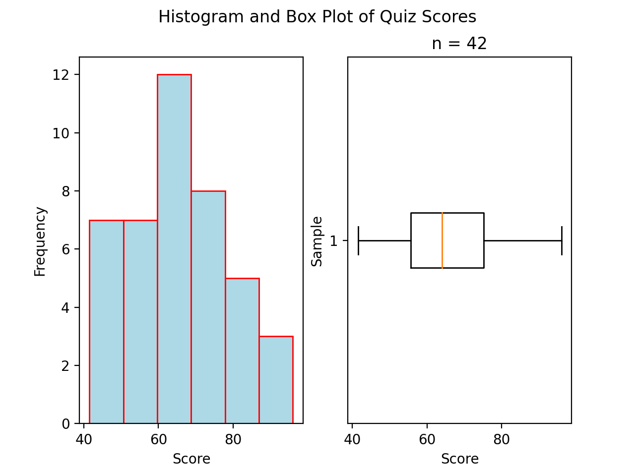
Boxplots#
While Histograms and Ogives provide a wealth of information about the sample distribution, they do not give us the whole picture. A boxplot can help fill in the blind spots, providing deeper insight in the nature of the distribution you are analyzing.
Construction#
Every boxplot requires five numbers. It may surprise you to find out (but probably not) these numbers are referred to as a Five Number Summary.
Five Number Summary#
To construct a boxplot, you must find the following:
Find the maximum observation.
Find the 75 th percentile (third quartile)
Find the 50 th percentile (median)
Find the 25 th percentile (first quartile)
Find the minimum observation.
Note
These terms (minimum, percentile and maximum) are defined in the Point Estimation section.
The middle three numbers, i.e. the third quartile, the median and the first quartile, form the box of the boxplot. The numbers on the ends, i.e. the maximum and minimum, are sometimes known as the whiskers.
By definition, the box of the boxplot will show you where 50% of the distribution is centered. In other words, between the third quartile and the first quartile, you will find 50% of all observations in a sample.
Distribution Shapes#
A boxplot provides another window into a distribution by revealing the characteristic features of important distribution shapes.
The comparative lengths of the boxplot whiskers show us in what direction the distribution is being pulled by outliers.
For this last reason, boxplots are often useful graphical tools for quickly identifying outliers. We will talk more about how to use boxplots to identify outlying observations when we get to the Interquartile Range descriptive statistic in the next section.
For now, we present various boxplots in order to exhibit how the distribution shape is manifested in the relative lengths of the whisker.
Normal#
(Source code, png, hires.png, pdf)

A normal boxplot has a box that sits evenly between its whiskers. The length of the left whisker is roughly equal to the length of the right whisker. There are no outlying observations to skew the whiskers.
Notice the red line that represents the median is roughly centered within the box.
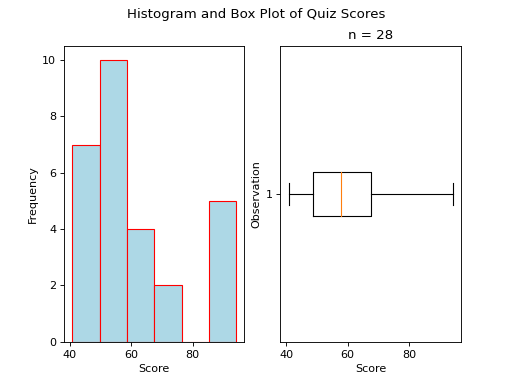
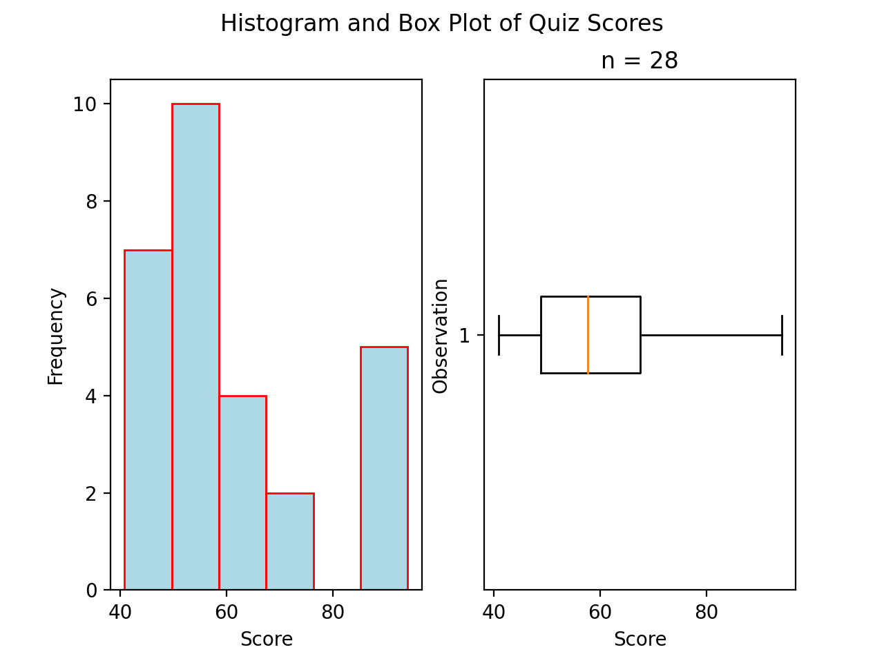
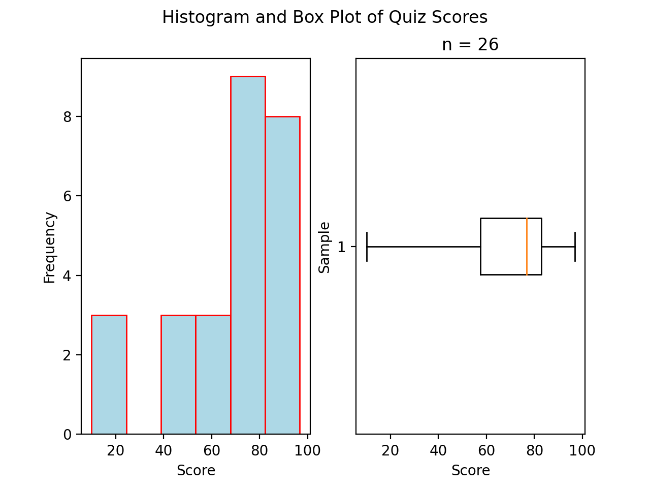
Skewed#
Skewed Right
(Source code, png, hires.png, pdf)

A skewed right boxplot has a box with lopsided whiskers. Its right whisker is pulled in the direction of the skew, i.e. towards the right. The presence of outlying observations on the right causes the distribution to stretch towards them.
Notice the red line that represents the median sits close to the left side of the box, where the majority of the distribution lies.
Skewed Left
(Source code, png, hires.png, pdf)
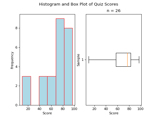
A skewed left boxplot has a box with lopsided whiskers. Its left whisker is pulled in the direction of the skew, i.e towards the left. The presence of outlying observations on the left causes the distribution to stretch towards them.
Notice the red line that represents the median sits close to the right side of the box, where the majority of the distribution lies.