Plots#
We will be using Python to generate graphs. Lots and lots of graphs. So many graphs, you might say it’s graphic.
This section serves as a gallery for all the different sorts of graphs you can create with Python. However, before we get to that point, we need to make sure our computers are setup with graphing capabilities. If you followed along with the Python Setup and completed all the steps on that page, you should be good to go. You may skip the next section in that case, or read through as a refresher (re-installing the graphics library won’t break anything).
By default, Python does not have statistical graphing capabilities. You must install two addition packages to supplement this deficiency, matplotlib and tk.
Prerequisites#
matplotlib#
matplotlib is a versatile library for generating just about any sort of mathematical graph you can imagine. To install it, open up the Linux Terminal on your ChromeBook and type,
pip3 install matplotlib
tkinter#
tkinter, or just tk, is a library for processing the results of matplotlib into pretty JPEGs and PNGs. You can also install it through the Linux terminal,
pip3 install tk
Now that we have everything we need, let’s take a look at the various plots we can create.
Importing#
When you import matplotlib into your scripts, the very first thing you should do is tell it to use the tk library to create graphs.
import matplotlib

matplotlib.use('tkagg')
This step is not, strictly speaking, necessary as most systems will default to using this library, but if your plots aren’t showing up or you experience other weird errors, this is the likely culprit. In the event something goes wrong and you can’t figure why, try adjusting this setting.
Creating the Axes#
To create a plot, we use the pyplot library within matplotlib package. The subplots() function within the pyplot library will generate an x-y plane canvas, called the axes.
The following code will create a figure and a set of axes on which we can graph.
# note: the `as` gives the library a short-cut name we can use.
import matplotlib.pyplot as plot

(fig, axes) = plot.subplots()
Note
fig, which stands for figure, is for drawing directly onto a 2D image using pixels. We will not use figures in this class to generate images. We are only interested in the axes, which allow us to graph things in the x-y plane.
Labelling#
Titles#
The following code adds a title to a plot,
import matplotlib.pyplot as plot

(fig, axes) = plot.subplots()

plot.suptitle("This is the Main Title")
Subtitles#
The following code adds a subtitle to a plot,
import matplotlib.pyplot as plot

(fig, axes) = plot.subplots()

plot.title("This is the Sub Title")
Axes#
The following code labels both the x and y axes in a plot,
import matplotlib.pyplot as plot

(fig, axes) = plot.subplots()

axes.set_xlabel("x units")
axes.set_ylabel("y units")
Multiple Graphs#
You can add multiple graphs to the same image by creating additional axes. You can create more axes by passing an argument into the subplots() function.
When you pass in arguments to subplots, it will return a list of axes. You can then access the individual axes by using their index,
import matplotlib.pyplot as plot

# create two sets of axes
(fig, axes) = plot.subplots(1, 2)

# plot the ordered pairs (4, 10) and (5, 11) on the first set of axes
axes[0].scatter([4, 5], [10, 11])
# plot the ordered pairs (-1, 5) and (2, -2) on the second set of axes
axes[1].scatter([-1, 2], [5, -2])
Note
The number of axes is the second argument of the subplots() function. We have to pass in a 1 first because matplotlib.pyplot always interprets the first argument as the number of figures.
Showing The Plot#
Once you have plotted something on the axes, you can display the plot with the show() function.
This example will plot the ordered pairs 
import matplotlib.pyplot as plot

(fig, axes) = plot.subplots()

plot.title("Ordered Pairs")

axes.scatter([1, 2, 3], [8, 9, 7])
axes.set_xlabel("X units")
axes.set_ylabel("Y units")

plot.show()
Styling The Graph#
All graphing functions in matplotlib accept color and ec arguments. These arguments will determine the fill color and outline color of the graph, respectively. For instance, the following code will generate a histogram with light blue bars outlined in red,
import random
import matplotlib.pyplot as plot

(fig, axes) = plot.subplots()

# generate some random data
data = [ random.random() for _ in range(100) ]

axes.hist(data, color='lightblue', ec='red')

plot.show()
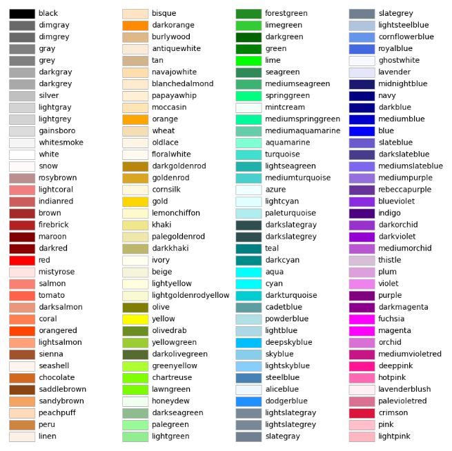
The full list of colors available to use in matplotlib is detailed in the following chart,
Gallery#
You can download the scripts used to generate any of these examples by clicking on the “source” link in the top right corner of the image.
Boxplot#
plot.boxplot()
import matplotlib.pyplot as plot

fig, axes = plot.subplots()

# generate some random data
data = [ random.randint(1, 50) for _ in range(100 ) ]

axes.boxplot(data)

plot.show()
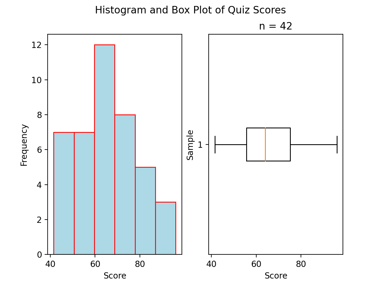
Boxplot Example
Below is an example of a boxplot, unrelated to the above code snippet.
(Source code, png, hires.png, pdf)

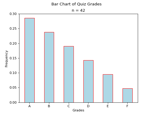
Bar Chart#
No Frills#
The code snippet below will generate a bar chart for the following frequency distribution,
x |
f(x) |
A |
10 |
B |
12 |
import matplotlib.pyplot as plot

fig, axes = plot.subplots()

values = [ "A", "B"]
frequencies = [ 10, 12]

axes.bar(values, frequencies)

plot.show()
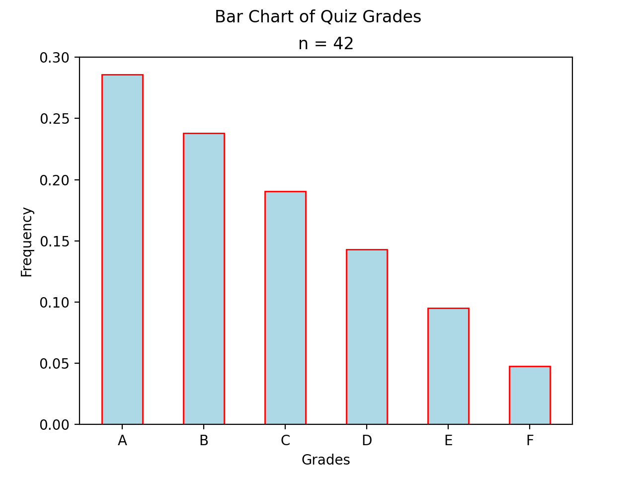
Barchart Example
Below is an example of a barchart, unrelated to the above code snippet.
(Source code, png, hires.png, pdf)
Stacked#
Suppose we have a sample of bivarate categorical data,

where x can take on the values A and B and y can take on the values C and D.
Suppose further we have the conditional distributions for the variable x conditioned on the other variable y.
x |
|
A |
0.7 |
B |
0.3 |

x |
|
A |
0.6 |
B |
0.4 |

The following code will generate a stacked bar chart to visualize the association between these two conditional distributions.
import matplotlib.pyplot as plot

fig, axes = plot.subplots()

conditional_frequencies_of_x_given_C = [ 0.7, 0.3 ]
conditional_frequencies_of_x_given_D = [ 0.6, 0.4 ]

axes.bar( "C", conditional_frequencies_of_x_given_C[0], label="C", color="lightcyan")
axes.bar( "C", relative_frequencies_A[1], bottom=conditional_frequencies_of_x_given_C[1], label="D", color="gold")

# don't label the second distribution, or you will get two legends on the graph
axes.bar("D", conditional_frequencies_of_x_given_D[0], color="lightcyan")
axes.bar("D", relative_frequencies_A[1], bottom=conditional_frequencies_of_x_given_D[1], color="gold")

plot.legend()
plot.show()
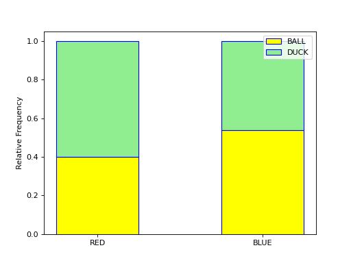
Stacked Bar Chart Example
Below is an example of a stacked bar chart, unrelated to above code snippet.
(Source code, png, hires.png, pdf)
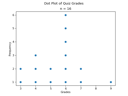
Dot Plot#
(Source code, png, hires.png, pdf)

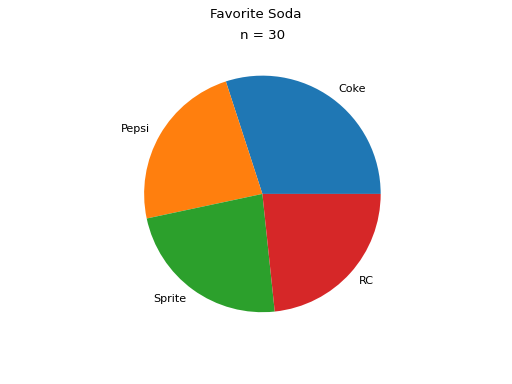
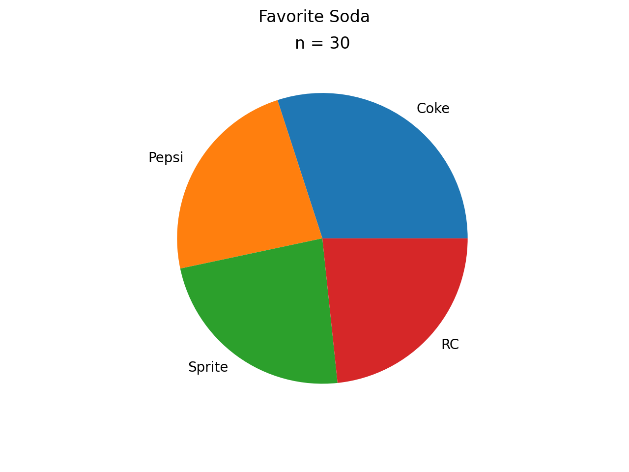
Pie Chart#
(Source code, png, hires.png, pdf)

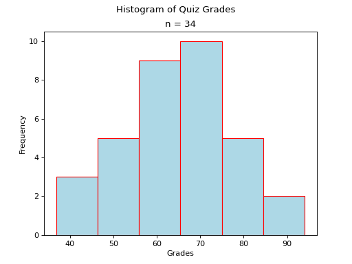
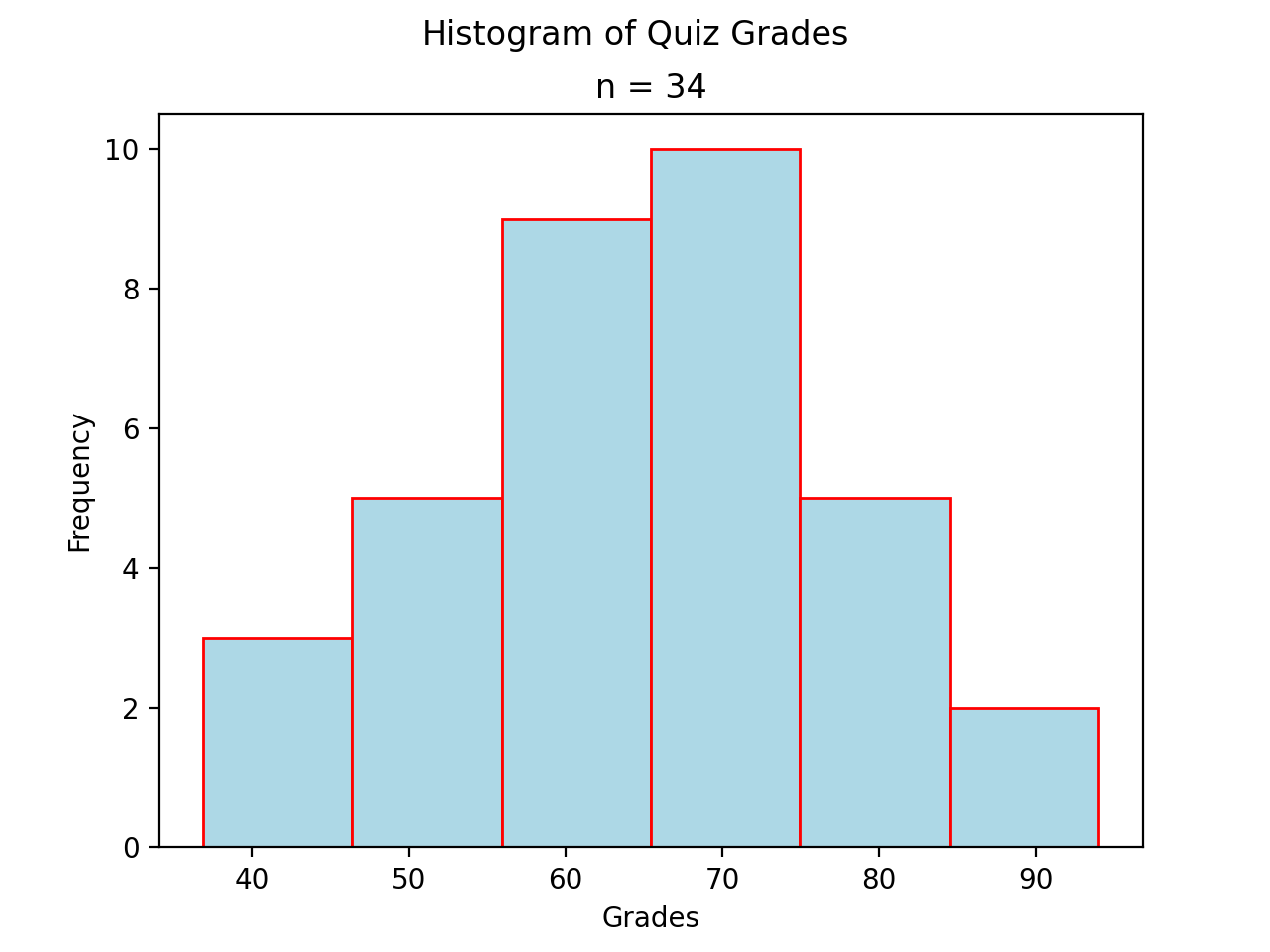
Histogram#
Normal#
(Source code, png, hires.png, pdf)

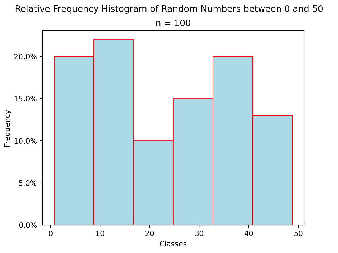
Relative#
(Source code, png, hires.png, pdf)

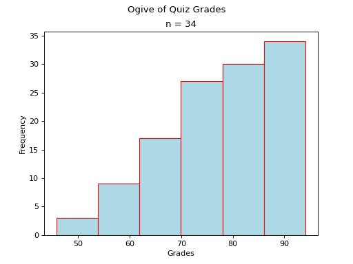
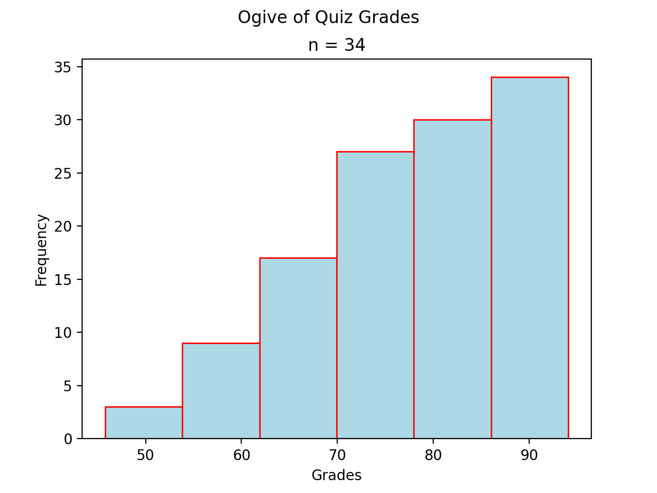
Ogives#
(Source code, png, hires.png, pdf)

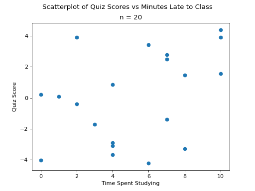
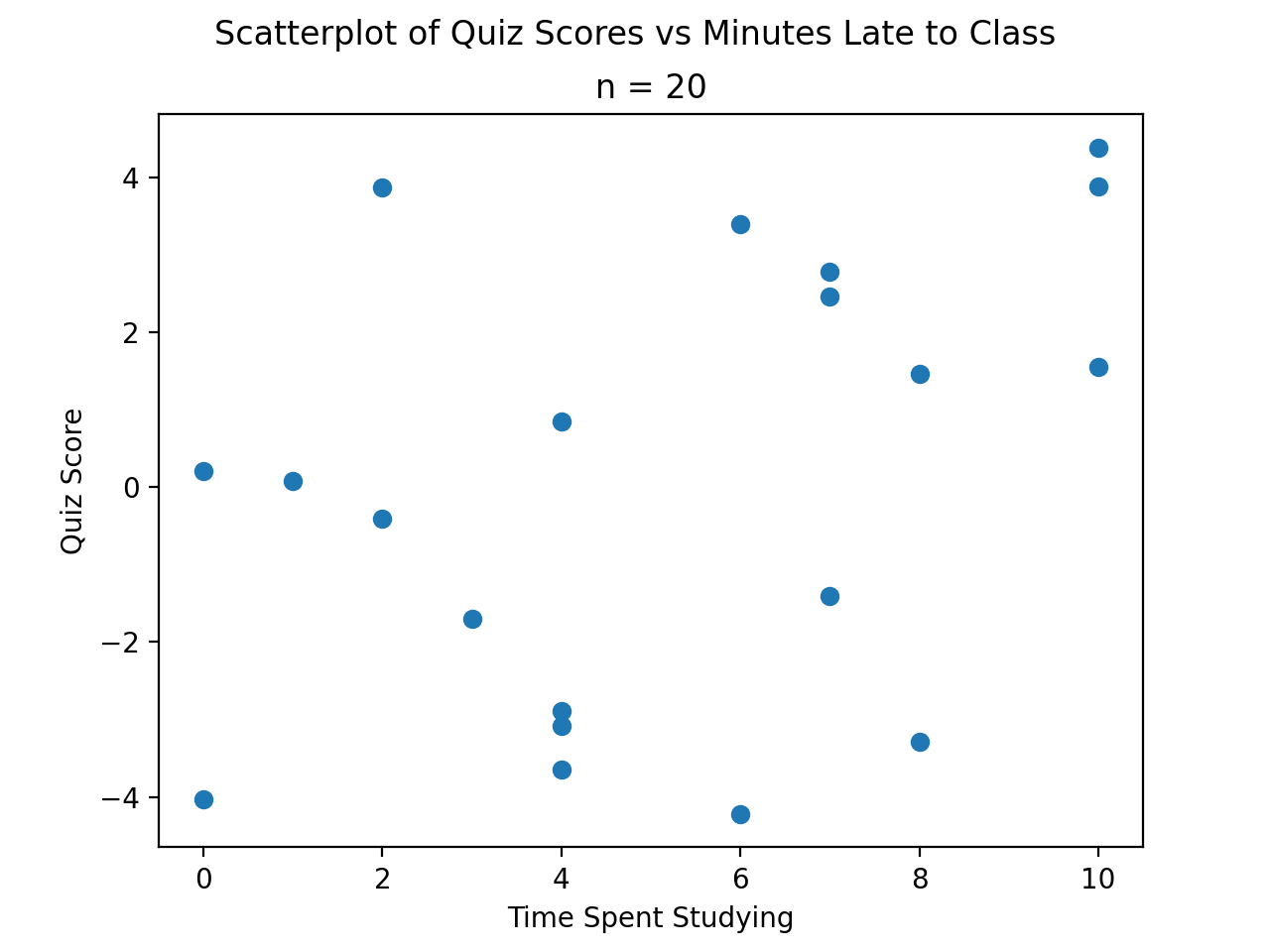
Scatterplot#
(Source code, png, hires.png, pdf)

Line Of Best Fit#
TODO
Error Bars#
TODO
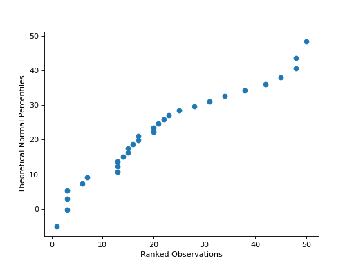
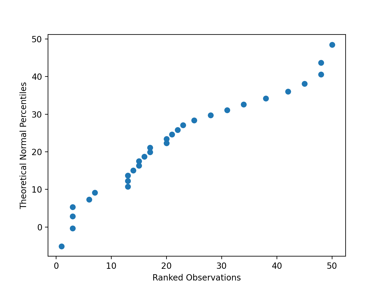
QQ Plots#
(Source code, png, hires.png, pdf)

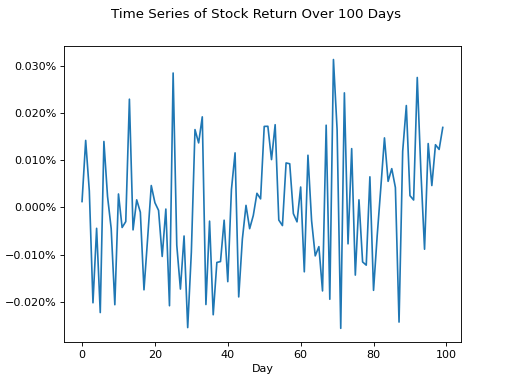
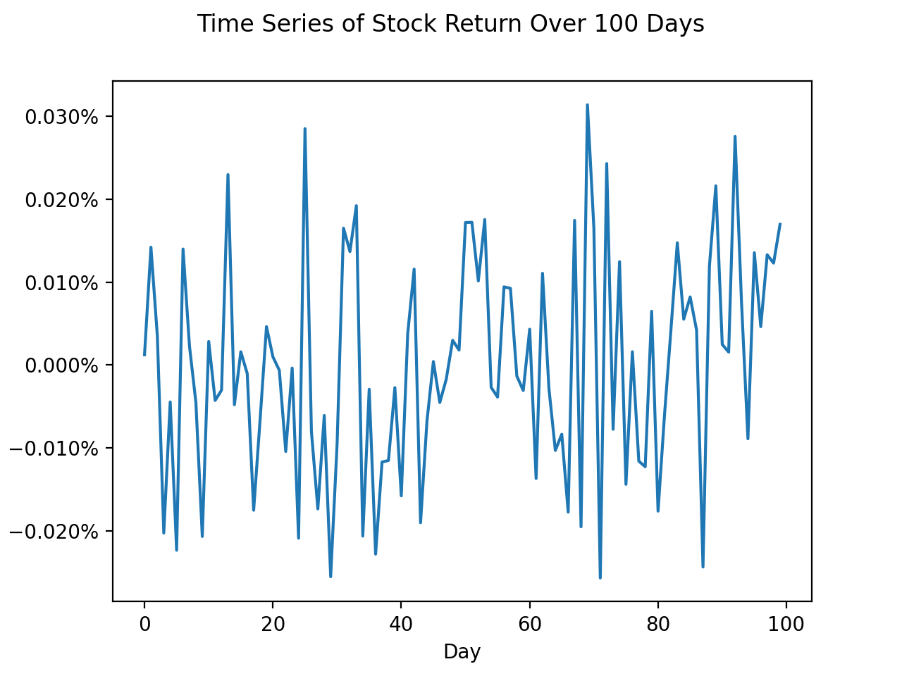
Time Series#
(Source code, png, hires.png, pdf)
