Point Estimation#
2019, Free Response, #1
The sizes, in square feet, of the 20 rooms in a student residence hall at a certain university are summarized in the following histogram.
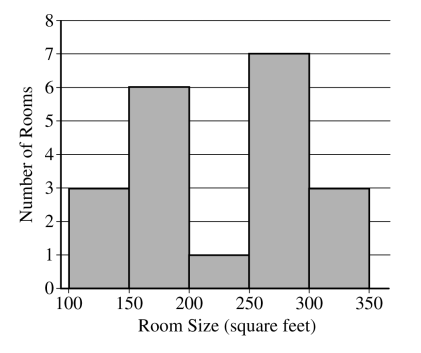
Based on the histogram, write a few sentences describing the distribution of room size in the residence hall.
Summary statistics for the sizes are given in the following table.
Determine whether there are potential outliers in the data. Then use the following grid to sketch a boxplot of room size.
What characteristic of the shape of the distribution of room size is apparent from the histogram but not from the boxplot?
2015, Multiple Choice #8
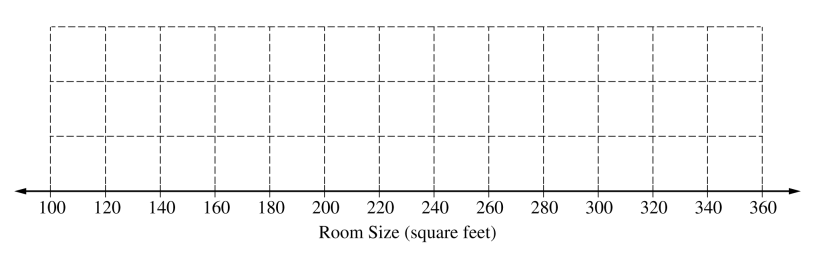
The 25 students in one professor’s introductory statistics course at a large university were surveyed and asked to report the number of siblings that they have. The histogram below displays the data collected in the survey.
Which of the following is the median number of siblings for these 25 students?
1
1.5
2
2.5
3
2016, Free Response, #1
Robin works as a server in a small restaurant, where she can earn a tip (extra money) from each customer she serves. The histogram below shows the distribution of her 60 tip amounts for one day of work.
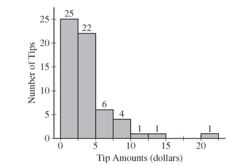
Write a few sentences to describe the distribution of tip amounts for the day shown.
One of the tip amounts was $8. If the $8 tip had been $18, what effect would the increase have had on the following statistics? Justify your answers.
The mean:
The median:
2006, Free Response, #1
Two parents have each built a toy catapult for use in a game at an elementary school fair. To play the game, students will attempt to launch Ping-Pong balls from the catapults so that the balls land within a 5-centimeter band. A target line will be drawn through the middle of the band, as shown in the figure below. All points on the target line are equidistant from the launching location.
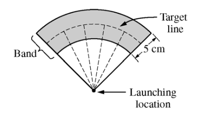
If a ball lands within the shaded band, the student will win a prize. The parents have constructed the two catapults according to slightly different plans. They want to test these catapults before building additional ones. Under identical conditions, the parents launch 40 Ping-Pong balls from each catapult and measure the distance that the ball travels before landing. Distances to the nearest centimeter are graphed in the dotplots below.
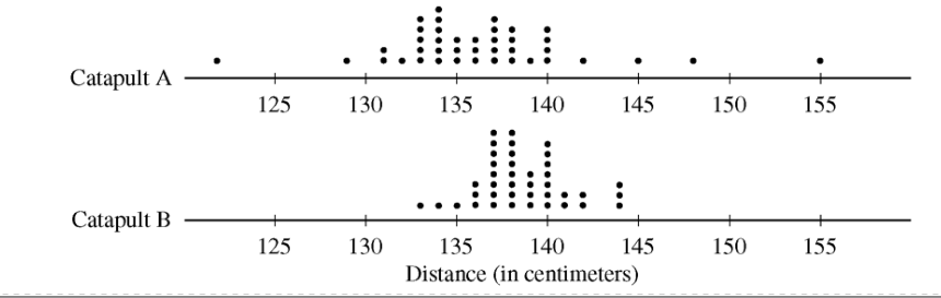
Comment on any similarities and any differences in the two distributions of distances traveled by balls launched from catapult A and catapult B.
If the parents want to maximize the percentage of having the Ping-Pong balls land within the band, which one of the two catapults, A or B, would be better to use than the other? Justify your choice.
Using the catapult that you chose in part b, how many centimeters from the target line should this catapult be placed? Explain why you chose this distance.
2003, Free Response, #1
Since Hill Valley High School eliminated the use of bells between classes, teachers have noticed that more students seem to be arriving to class a few minutes late. One teacher decided to collect data to determine whether the students’ and teachers’ watches are displaying the correct time. At exactly 12:00 noon, the teacher asked 9 randomly selected students and 9 randomly selected teachers to record the times on their watches to the nearest half minute. The ordered data showing minutes after 12:00 as positive values and minutes before 12:00 as negative values are shown in the table below.
Students |
-4.5 |
-3.0 |
-0.5 |
0 |
0 |
0.5 |
0.5 |
1.5 |
5.0 |
Teachers |
-2.0 |
-1.5 |
-1.5 |
-1.0 |
-1.0 |
-0.5 |
0 |
0 |
0.5 |
Construct parallel boxplots using these data.
Based on the boxplots in part #a, which of the two groups, students or teachers, tends to have watch times that are closer to the true time? Explain your choice.
2006, Free Response Form B, #1
A large regional real estate company keeps records of home sales for each of its sales agents. Each month, the company publishes the sales volume for each agent. Monthly sales volume is defined as the total sales price of all homes sold by the agent during a month. The figure below displays the cumulative relative frequency plot of the most recent monthly sales volume (in hundreds of thousands of dollars) for these agents.
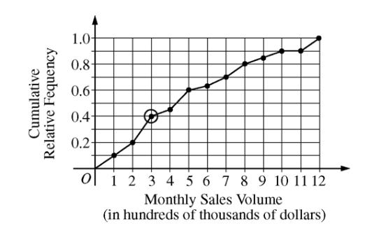
In the context of this question, explain what information is conveyed by the circled point.
What proportion of sales agents achieved monthly sales volumes between $700,000 and $800,000 ?
For values between 10 and 11 on the horizontal axis, the cumulative relative frequency plot is flat. In the context of this question, explain what this means.
A bonus is to be given to 20 percent of the sales agents. Those who achieved the highest monthly sales volume during the preceding month will receive a bonus. What is the minimum monthly sales volume an agent must have achieved to qualify for the bonus?
2007, Free Response, #1
The department of agriculture at a university was interested in determining whether a preservative was effective in reducing discoloration in frozen strawberries. A sample of 50 ripe strawberries was prepared for freezing. Then the sample was randomly divided into two groups of 25 strawberries each. Each strawberry was placed into a small plastic bag.
The 25 bags in the control group were sealed. The preservative was added to the 25 bags containing strawberries in the treatment group, and then those bags were sealed. All bags were stored at 0⬚C for a period of 6 months. At the end of this time, after the strawberries were thawed, a technician rated each strawberry’s discoloration from 1 to 10, with a low score indicating little discoloration.
The dotplots below show the distributions of discoloration rating for the control and treatment groups.
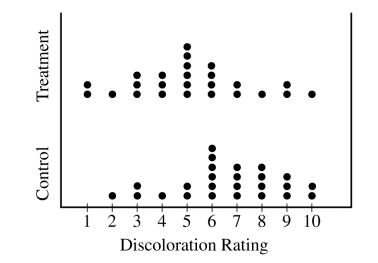
Find the mean and median of both the test group and control group.
Comment on the shape of the control distribution versus the shape of the test distribution. Justify your answer with calculations.
Based on the dotplots and your answers to part #a and #b, comment on the effectiveness of the preservative in lowering the amount of discoloration in strawberries.
2021, Free Response, #1
The length of stay in a hospital after receiving a particular treatment is of interest to the patient, the hospital, and insurance providers. Of particular interest are unusually short or long lengths of stay. A random sample of 50 patients who received the treatment was selected, and the length of stay, in number of days, was recorded for each patient. The results are summarized in the following table and are shown in the dotplot.
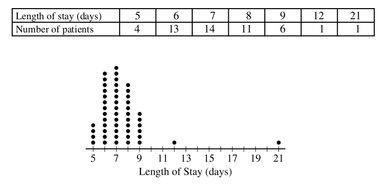
Determine the five-number summary of the distribution of length of stay.
Consider two rules for identifying outliers, method A and method B. Let method A represent the 1.5 x IQR rule, and let method B represent the 2 standard deviations rule.
Using method A, determine any data points that are potential outliers in the distribution of length of
stay. Justify your answer.
The mean length of stay for the sample is 7.42 days with a standard deviation of 2.37 days. Using method B, determine any data points that are potential outliers in the distribution of length of stay. Justify your answer.
Explain why method A might identify more data points as potential outliers than method B for a distribution that is strongly skewed to the right.
Question Bank
To determine the amount of sugar in a typical serving of breakfast cereal, a student randomly selected 60 boxes of different types of cereal from the shelves of a large grocery store.
The student noticed that the side panels of some of the cereal boxes showed sugar content based on one-cup servings, while others showed sugar content based on three-quarter-cup servings. Many of the cereal boxes with side panels that showed three-quarter-cup servings were ones that appealed to young children, and the student wondered whether there might be some difference in the sugar content of the cereals that showed different-size servings on their side panels. To investigate the question, the data were separated into two groups. One group consisted of 29 cereals that showed one-cup serving sizes; the other group consisted of 31 cereals that showed three-quarter-cup serving sizes. The boxplots shown below display sugar content (in grams) per serving of the cereals for each of the two serving sizes.
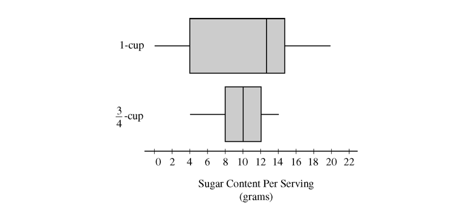
Two box plots are shown using the same horizontal axis, which shows sugar content per serving in grams and is labeled from 0 to 22 in increments of 2. The bottom plot is for three quarters of a cup. The box extends from 8 to 12 with a vertical line at 10 dividing it into two regions. A horizontal line off the left of the box extends to 4 and a horizontal line off the right extends to 14. The top plot is for one cup. The box extends from 4 to 14 with a vertical line at 12 dividing it into two regions. A horizontal line off the left of the box extends to 0 and a horizontal line off the right extends to 20.
Write a few sentences to compare the distributions of sugar content per serving for the two serving sizes of cereals.
After analyzing the boxplots on the preceding page, the student decided that instead of a comparison of sugar content per recommended serving, it might be more appropriate to compare sugar content for equal-size servings. To compare the amount of sugar in serving sizes of one cup each, the amount of sugar in each of the cereals showing three-quarter-cup servings on their side panels was multiplied by 4/3. The bottom boxplot shown below displays sugar content (in grams) per cup for those cereals that showed a serving size of three-quarter-cup on their side panels.
Two box plots are shown using the same horizontal axis, which shows adjusted sugar content per serving in grams and is labeled from 0 to 22 in increments of 2. The bottom plot is for three quarters of a cup. The box extends from 10 to 16 with a vertical line at 13 dividing it into two regions. A horizontal line off the left of the box extends to 5 and a horizontal line off the right extends to 20. The top plot is for one cup. The box extends from 4 to 14 with a vertical line at 12 dividing it into two regions. A horizontal line off the left of the box extends to 0 and a horizontal line off the right extends to 20.
What new information about sugar content do the boxplots above provide?
Based on the boxplots shown above on this page, how would you expect the mean amounts of sugar per cup to compare for the different recommended serving sizes? Explain.